Friday, 29 November 2013

DESIGN PRODUCTION - BRIEF 1 - PANTONE FORMULA GUIDE RESEARCH

Firstly, I decided that my outcome will utilize a similar form and binding method to the 'Pantone Formula Guide' used to accurately select and communicate colour.

As my outcomes form is predominantly based on the Pantone guide I though it was important to review the guides construction first hand. 

What am reviewing;
  • Stock (covers and pages).
  • Binding method.
  • Finishing methods (laminates etc).
  • Text size.
  • Page layouts.


  • The Pantone Guides are packaged in a protective case to help prevent against deterioration when not used, the case also doubles up as a handy way of keeping individual guides together.
  • My outcome could utilize a case or display stand so that it is not just left around when not in use.


  • The corners of the guide have been rounded which helps against the deterioration of the pages.  
  • A laminated stock has been used for the cover and bottom of the guide, this will help with the cleaning of the product if inks transferring onto guide.


  • Surprisingly a relatively thin stock has been used for the pages of the guide meaning that when you pick the guide up it bends in an uncontrollable manner, this is a serious design flaw as it affects the ability to easily navigation through the pages of the guide.
  • A thicker stock has been used for the cover and back pages, however it is still not strong enough to support the weight of all the pages. 
  • Moreover, a mixture of gloss and matt stocks has been used throughout the guide, the stock differs as this guide shows colours printed on coated paper. 
  • When selecting the stock for my outcome I will utilize a thick paper stock with a gsm of around 270 to help prevent against the bending of pages, the thicker stock used for the covers and title pages will also help with the stability of the outcome.


  • All of the text has been printed at a small size (6pt at a guess) to ensure that all information could fit into the space provided.
  • My guide will look similar to this when opened.


  • Page detail.


  • To bind the individual pages together a plastic binding screw has been used.
  • I will utilize the same binding method to hold the pages of my outcome together.


Monday, 25 November 2013

DESIGN PRODUCTION - BRIEF 1 - STUDIO VISIT

When we arrived at the print co-op we were introduced to James who showed us round the facilities and walked us through the risograph print process. 


ABOUT 

The 'Footprint Workers Co-op' is a co-operatively owned printing business (the company is owned by the workers) run by a group of very friendly, interesting individuals. They offer a complete risograph printing service with binding options available too. 

One of the co-op's beliefs is to run a completely environmentally friendly print service, this means that the inks used are soy based and all paper is recycled. As an ethically driven designer this concept really interested me as I am always looking for ways to make my practice more environmentally friendly. The company stood out to me as a business that I would like to work with in the future when printing my outcomes. 


PRINTER

The printer shown below works in a similar fashion to screen-printing, hence why some people refer to the process as 'Digital screen-printing'.


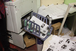
  • This is the printing drum, ink containers are placed into the centre of the drum with the stencil attached to the outside.
  • When on, the ink is pushed out of the drum, through the stencil and onto the design.


  • Detail shot showing the stencil on the drum, the design that will be printed can be just be seen.
  • There is a special paper used for the stencil which costs a lot of money, this accounts for some of the standardised set up cost for each print job.


  • The print is passed through this section of the machine before being fired out into the collection tray.


  • The printer is capable of printing up to around 150 sheets a minute, however when running at higher speeds print imperfections are more common.


  • This image shows the machine used for binding, otherwise known as a collating machine.
  • Piles of paper containting individual spreads are placed onto each shelf of the machine.
  • When on, the machine will take a piece of paper from each shelf and bind using staples. 


ADDITIONAL NOTES

  • An applicable print method for runs over 100.
  • Cheap and environmentally friendly.
  • Inks can take a while to dry and still smudge even when dry.
  • Can only print up to A3 in size.


PRINT EXAMPLES

After James had finished speaking about the various aspects of the Risograph print process he let us take a selection of prints from the recycling pile.

I am planning on cutting up these example prints and using them in my print guide to act as a physical print example for the audience. Including printed examples allows users to see the effects achieved using the individual print method. 

I originally wanted to print my own examples using the risograph printer, however James explained that there is a standardised set cost charged on each job for the inks and stencil paper. Therefore, small run jobs are just not worth the set up cost.


CONCLUSION

Firstly, I really enjoyed visiting the studio as it introduced me to some information my internet based research did not cover, the visit also gave me the opportunity to see the printer in action and review the quality of the prints. 

The printed outcomes have an effect very similar to screen-printing, a print method that has been at the forefront of my design practice since I started the course last year. As the print process is able to produce these screen-print style outcomes it is very relevant to my print  driven design practice. Moreover, combine this with the fact that the at the printing process is environmentally friendly and you have a print method which perfectly suits my ethos and practice as a designer.

Finally, visiting the studio has only furthered my interest into the print method, after learning more about the specifics of the process and seeing the quality of the outcomes I have realized that this is a print process I hope to regularly introduce into my practice.

DESIGN PRODUCTION - BRIEF 1 - PRODUCTION RESEARCH

  • There are two main image types used: rater and vector. Each format has benefits and weaknesses which make the suitable for different purposes.
  • A raster images is formed from pixels on a grid.
  • Each pixel contains colour information for the reproduction of the image.
  • Raster images do not scale well.
  • Raster images are usually saved as TIFF. or JPEG. 
  • A vector image is made from scaleable paths that use a mathematical formulae to help them scale to large sizes and keep a high resolution. 
  • Can be be scaled infinitely and keep a crisp form. 
  • Vector files must be saved as an EPS format to retain their scaleability. 


  • Digital images can be saved in a variety of file formats each with their own specific advantages and disadvantages.
  • A 'bitmap' or 'raster' is any image that is formed by pixels on a grid. 
  • Each pixel contains colour information relating to the image.
  • Bitmap images do not scale well when resized as they have a fixed resolution.
  • Converting a continuous tone image, such as a greyscale photograph, to a bitmap image reduces the pallet to black and white only.
  • The contrast can be adjusted using the threshold. 
  • A pattern dither uses a halftone pattern to simulate information however, this can produce a distinct pattern.
  • A line art image is an image that is created with lines that lack any fill, colour or shading. 
  • A line art image has no tonal variation and so requires no screening for print, this makes the image suitable for laser cutting and embossing plates.


  • A greyscale image is an achromatic tonal scale of values that mixes blacks and whites to create a full range of greys.
  • The greyscale setting is used to reproduce continuous tone photographs, it achieves this by changing colour to the most approximate levels of grey.
  • Greyscale contains upto 256 tones of grey.
  • The intensity of the greys is reproduced on the plate using halftone patterns. 
  • A halftone image is created by converting a continuous tone image into a composition of dots.
  • Designers can controlled and changed the settings of the halftone to achieve different effects. Programs such as photoshop allow designers to change the screen angle and dot size of a halftone, changing either of these settings will change the appearance of the image.
  • Greyscales, bitmaps and line arts can be easily recoloured using various desktop publishing programs.   


  • A designer will usually work with two different file formats, when working with screen based images the JPEG. file type is used. When working with printed images the TIFF. file type is typically used as it is capable of storing more information. 
  • Other, lesser used file types are also available that have applicable uses designers can exploit.
  • High quality photographs are captured in RAW. format to ensure the file retains as much as possible information. 
  • Information in a RAW. file is saved in 16 bytes/channels allowing teh file to contain a high degree of colour information.
  • Raw files are lossless. 
  • Once edited and scaled a raw file should be converted into a TIFF. or JPEG file (lossy).


  • RAW - The raw format captures the maximum amount of continuous tone colour information when taking photographs. 
  • EPS Files (Encapsulated Post Script) - A format usually used for scalable graphic elements.
  • Vector Illustrations - Vector illustrations are saved as EPS files as they allow for scalable graphic elements.
  • TIFF (Tagged Image File Format) - A format used for continuous-tone images, predominantly used for printed images. 
  • Gif's - The GIF format is used for flat graphics that have no tonal values such as line art as it generates sharp lines. GIF's use 256 colours and can be easily compressed - similar to a JPEG.
  • The JPEG. format compresses file information to make images more suitable for web application. If the file is compressed too much image quality will be affected. 
  • PiCT - A mac based format used for compressing images.
  • BMP(Bitmap) - A format for 24 or 32-bit colour images.
  • PDF (Portable Document Format) - A portable format used for sending files to clients and printers, a PDF will save all graphic elements necessary for the reproduction of the design.
  • The information regarding the different file types and their applications is simply concluded in the table displayed above. The table organises information on the different file types in a simple easy to follow way, enabling viewers to quickly navigate to specific information. My outcome could include a similar table to allow viewers to quickly access the relevant information needed.


  • Images will usually need working on before being applied to a graphic outcome.
  • Resizing images - Images will often need resizing before being used on a graphic piece as the images are rarely scaled to the desired size.
  • Enlarging images digitally generally results in a deterioration of quality. 
  • Some quality loss can be acceptable, however if not then the image should be rescanned at a higher resolution. 
  • Image size - Image size can be adjusted by changing the pixel dimensions or document size, these values are related so they retain the documents form when scaled. 
  • This allows designer to have more control when adjusting the size of an image.
  • Information is concluded in an easy to follow table, my outcome should make use of similar methods of communicating information. 


  • Digital images contain several different channels that hold information for the different colours of the colour space used to produce it.
  • RGB images - Additive colour primarys (colours get lighter when mixed) made from red, green and blue. 
  • Three channels, one for each colour.
  • RGB images are used for screen based media as they match the RGB colour systems used on screens.
  • RGB images are brighter than CMYK ones and have smaller file sizes as they contain less information.
  • CMYK images - CMYK images are made from cyan, magenta, yellow and key (black).
  • Four colour channels, one for each colour (larger than RGB files due to the extra colour channel).
  • When combined the four colours can create a full colour image. CMYK files are used for the printing process as each colour corresponds to one of the four printing plates.
  • Splitting channels - A digital image can be split into separate channels allowing designers to adjust layers individually. This can be done to make subtle adjustments to individual laters.


  • The resolution of an image is determined by the amount of information it has, images with more information have higher resolutions.
  • Resolution is also determined by pixel depth, the amount of bits available to generate colour for each pixel. The greater the bit depth means that more colours are available and more accurate colour reproduction can be achieved. 
  • A 1-bit pixel depth means that the image will contain either black or white tones.
  • An 8-bit pixel depth means that you can reproduce 256 shades of grey.
  • An 8-bit pixel depth can also be used to reproduce a colour pallet consisting of 256 colours, this is often used as the basic screen reproduction.
  • Coloured 8-bit can result in washed out looking colours.
  • Display examples of each.


  • A 24-bit pixel depth is capable of producing about 16 million different colours and so is used for more realising looking continuous tone images.
  • A 16-bit RGB pixel depth means that all colour channels have 16-bits, the result is a 48-bit image capable of producing billions of colours.
  • Converting a 24-bit RBG tonal image into a CMYK image produces a 32-bit image that has four colour channels rather than three.
A 16-bit image - Link


  • The term resolution refers to a measure of the number of pixels in a digital file. In the design industry it is important to know the difference between the different available resolutions and how they affect images during the production process. 
  • SPI - refers to the number of examples a scanner head takes down as it passes over an image.
  • PPI - is a term referring to the number of pixels displayed both horizontally and vertically in each square inch of a digital image.
  • The lower the PPI of an image the more pixelated it will appear, this is because there is not enough information to reproduce the images continuous tone.
  • Pixelation can also occur when you scale an image too much.


  • DPI - Measures how many ink dots per inch a printer can deposit onto to a piece of stock. For most commercial printers a standard resolution of 300dpi is usually used.
  • LPI - Meausres the number of cells in a halftone gird.
  • Specifying resolution - PPI refers to the number of pixels per inch in your image, it affects the size and quality of the outcome. However, PPI does not affect the printed size of an image, only its quality and file size. DPI refers to the number of droplet of ink per inch that the printer will print, the higher the DPI the better tonal quality of the outcome.


  • Overprinting is a term that refers to overprinting two inks so that they create a new colour.
  • To work with overprints the software will need to be set to the overprint colour mode, this will help prevent colours being knocked out by other colours. Overprints can only be printed in the order that they are laid down on the printing press.
  • With CMYK cyan can overprint all colour whereas yellow can only overprint black.
  • CMYK colours overprint the stock they are printed on.
  • The default settings on most pieces of software preserve each colour as they knock out of each other.
  • To overprint colours certain software settings need to be changed, then where colours overlap a new, darker colour will be created.
  • All four colours can be overprinted to create a black tone.
  • My outcome should have overprint examples to help designers understand the concept.

Juan Esteban Rodríguez - two colour screen print - Link


  • Once a design has been successfully created there are certain steps a designer can follow to help ensure that no mistakes or errors arise during the reproduction (printing) of the outcome.
  • The responsibility of whether the printed outcome is an accurate reproduction of your file lies with the printer, however there are steps that can be followed to help contribute towards the elimination of errors. - rewrite.


  • Bleed - The printing of a design over the trim marks to help to avoid white page edges after the trimming process. 
  • Registration - The alignment of printed elements on a single piece of stock, used when more than one colour is applied to the print job.
  • Trim - The process of cutting away excess stock once the design has been printed.
  • Registration problems will not arise if printing with one colour as there is no need for the alignment of a second printing plate. However, registration problems start to occur when more than one colour is introduced to the print job. 


  • The aim of a print job is to obtain accurate colour representation and exact registration. Unfortunately, this is not always possible, gaps can appear when two solid colours are printed next too each other and the registration is slightly off. Luckily, this is a problem that can be overcome through the use of ink-trapping.
  • There are three main types of trapping used to overcome registration problems.
  • Spread - The lighter object is made larger to spread into the darker one.
  • Choke - Reduces the size of the darker colour so it covers the lighter layer below.
  • Centred trapping - combines enlarging and reducing both colours by the same amount.


  • Throw-outs and gatefolds are ways of inserting extra and/or oversize pages into a publication.
  • Gatefolds - A gatefold is a folded four panel sheet that is bound into a publication allowing the outer panels to fold inwards towards the spine. The method is often used in magazine style publications to provide extra space for content.
  • The outer panels of the gatefold are slightly narrower than the inner ones to provide enough room for them to fit once folded inwards.
  • Throw-outs - A throw out is half a gatefold that is bound into a publication allowing the outer panel to open at one side only. 
  • Similar to a gatefold the outer panel must be narrower than the inner one so that it can fit well when folded. 


  • Tip-ins - A tip-in is the attachment of a single page into a publication by gluing along the binding edge of a page and attaching it to a central fold. If a tip-in is shorter than the page it is attached to it should be aligned to either the top or bottom of the page.
  • Tip-on - A tip-on is when a page or other design element is pasted into a publication. The tip-on can be located anywhere on the page and can be a permanent or temporary feature depending on the attachment method used.


  • Proofing allows designer to form checks at various stages of the design and production process to ensure that the design will be accurately represented when printed.
  • There are various proofs that can be utilized to check the colour, registration and layout of a printed outcome.
  • Screen proof - 
  • Laser proof- A black and white computer print, allows designers to see photos and text positioning.
  • Pre-press proof - A digital proof that gives allows designers to see what the finished piece will look like, it is an inexpensive method but colours are not always accurately represented.
  • Blueline proof - A contact print produced from film, all colors are shown in blue. The negatives used for the printing plates are exposed to a special type of paper to produce the image of the blueline.
  • Scatter proof - A proof of an individual or multiple photos not included as part of the page layout. The method is used to check colour before the final proof is made and allows multiple photos to be checked at once.
  • Press or machine proof - A proof made using the actual printing plates, ink and stock. Produces a realistic outcome very similar to the final printed product. Costly method, especially if more changes are needed.
  • Contract proof - A full colour proof that is looked at as a contract between the printer and client, used as the final proof before the outcome is sent to print.  


  • It is a designers job to communicate the print requirements of a job through a print order. The print order will specify the print method to be used, the stock choices, the number of prints and any special finishing techniques.
  • It is important for a designer to understand the specifics of the print process to ensure that the requirements of the job are accurately communicated.


Saturday, 23 November 2013

DESIGN PRODUCTION - JASON (EVOLUTION PRINT) - LECTURE

Below are my notes taken from Fridays print lecture with Jason from Evolution Print in Sheffield.


Friday, 22 November 2013

DESIGN PRODUCTION - BRIEF 1 - VISUAL RESEARCH


Pantone Formula guide

Link

  • The pantone guide on the left is much wider than the standard pantone guide which is featured on the right. To ensure that I can fit all of my content into the guide my outcome will utilize a wider form similar to the pantone guide above.


GF Smith - Paper Guide.

I used the GF SMith paper guide to help me define the kind of stock that I want to use on my outcome. While browsing the booklets content I came across some layouts and aesthetic features that helped influence the direction of my outcome.


  • All text and graphics in the book are printed using a dark grey colour which complements the off white stock that the booklet is printed on.
  • When printing my outcome I will experiment with a dark grey pallet as the subtle colour scheme is inviting for the viewer.


  • The booklet also features a variety of tables displaying information relating to 'gsm' and 'sheet size'. All data has been arranged using a grid layout so that the layout is organised and easy to digest.
  • The tables also make use of lines to signify a divide in certain parts of information. Different line weights have been utilized to signify different things, for example lineage at the top of each section has a heavier weight. 
  • When organising my information I will follow similar rule to ensure that my data is easy to digest and aesthetically pleasing.   


  • This additional information has been placed into a single thin column at the edge of the page, any data displayed in my outcome will be arranged in a similar composition due to the chosen form.


Uncovered - Marina Soto


  • Grid set type leaves negative space which balances the page and guides the viewers eye to important information. My outcome will not be able to contain as much negative space due to its small size, however all graphic elements will placed using a grid.

]
Link

  • Light text printed on a dark stock helps with legibility as the letterforms are easily defined from the page. My outcome could make use of both light and dark stock to show the audience the benefits of each.


DLA - Akos Polgardi 


  • The laser engraved effect on the publication sleeve is aesthetically engaging and creates a tactile feeling for viewers, this sets the publication apart from other outcomes that use less experimental process techniques.
  • My outcome needs to be aesthetically engaging as it has a target audience of creatives, therefore it will utilise a combination of process and finishing techniques to create an attention grabbing aesthetic appearance.


  • The diagrams shown in the publication effectively utilize lines and shapes with a very light line weight, they are successful because the weight is consistently used across all diagrams and other visual elements.
  • Reviewing the diagrams made me think about that graphics that will be featured in my outcome, any diagrams featured in my outcome will make use of a heavier line weight which will be used consistently across all illustrated elements. 

Link

  • Simple effective contents page helps with viewer navigation. 
  • My outcome will need to be easily navigable as students will be referring back to information while completing various parts of the print process. Therefore, my outcome will feature a contents page and chapter dividers.


MAG IS IN - publication project - Francesca Oddenino & Vanessa Poli


  • Publications feature a numbering system similar to the one used when numbering prints, I could utilize a similar feature in my outcome as it directly relates to the publications content.


  • The magazines makes use of a simple yet effective colour scheme consisting of black and orange. The designer has also made use of the tints available for each colour allowing for a variety of colour variations.
  • I want to use a limited colour pallet similar to the one used on this publication when creating my outcome.


Pure Magazine - Patrycja Dulnik


  • Pure magazine by Patrycja Dulnik also utilizes an effective simple colour pallet consisting of  a dark grey and a strong blue spot colour. 


  • The publication makes frequent use of footers to add extra information regarding the magazine.
  • As my outcome is only small it could make use of headers and footers to help place consistent information (page number, chapter name etc) on each page.  


ABSCHLUSSKATALOG - Britta Siegmund 


  • The above publication successfully utilizes the edge painting technique to inject vibrance into an otherwise dull outcome.
  • I want my outcome to have a dominating black aesthetic appearance, to achieve this my publication will need its edges painting black in a similar fashion to the featured work.  


Youth - Pablo Salatin


  • While browsing through 'Behance' I discovered this publication work created by designer Pablo Salatin and instantly became inspired by the small bookmark type object seen on the left.
  • The product simply uses a serif typeface with text reading the title of the publication. Although very simple in aesthetic appearance I feel that the oversize type has some communication benefits as the title is immediately communicated. 
  • My publications cover could use similar typographic form to engage viewers.
Link


Selah Restaurant Brand Identity - Geoff Courtman 

Link

  • Foiling applied to a black stock creates an appealing visual contrast that attracts the attention of the viewer, I could utilise foiling in my final outcome to focus viewer attention on important aspects of my outcome.


Filthy Black Italic, Specimen sheet - Filthy Media


  • This type specimen sheet from design firm 'Filthy Black Media' uses a spot uv varnish on black stock to create a subtle yet aesthetically engaging outcome. 


  • As my outcome will utilize dominant black aesthetics on the covers and page edges my publication could use a spot uv varnish to display the title and any cover aesthetics.
  • Unfortunately, spot uv varnishes are not available at university and so the desired affect will not be achieved. I could try using the normal spot varnishes available at university however, they create a flatter, matt effect.

Link

  • To achieve the desired effect I will use a clear foil on black stock.


Chris Wood Branding - Chris Wood

Finally, I looked at some personal branding created by Chris Wood, the images are relevant to my design process as they show how DIY edge painting can successfully be achieved.


  • Use a clamp to tightly secure all the stock together, the tighter the hold the better the outcome as any gaps could result in paint bleeding past the edges and into the pages.


  • Once secured with the clamp use spray paint to paint the edges of the stock.


  • Leave the stock secured in the clamp until the paint is dry.
  • Once dry remove and separate any pages that are stuck together.