Sunday, 2 December 2012

DESIGN PROCESS - PHOTOSHOP

Below is my research for the Photoshop postcards brief. I have researched into a range of photographs that are relevant to my project, editing techniques that could be used to produce my outcome and existing graphic postcard designs.

Firstly, as the brief requires us to base the theme of our photos around a square, I looked into photography that focused on and around shapes.


My photographs could be based around square objects that I find around the college, below are a selection of images that explore this idea. 


Squares can be found on parts of doors. I could base my project on the range of different squares found on doors around the college.

dutch architecture
Parts of the buildings architecture can also form shapes such as the triangles seen above.

dutch architecture photography.
Another example of shapes found within architecture.

shapes
Here the panels of the building create a triangle. I could consider focusing on bricks/square roof tiles.

 I like the idea of shooting pictures of or through square windows around college.


light and shape
Further example of square windows.


light and shape // Katie Newburn Photography
Shapes can also be found within objects found around college. 

Art Splash: The Shaping of New Visions: Photography, Film, Photobook - MoMA - New York
http://pinterest.com/pin/101119954104679152/

Architectural Shapes on Photography Served
I noticed that most of the strongest images I have collected have revolved around architecture, I could focus my images on the square architectural features of the college building. 


Moreover, I also started looking a photos that were cropped or shaped, such as photos shot on 120-format film. 

Photography by Marco Suarez.     I really like the circular shape for the images, i think it's different and attention grabbing. As I'm looking at the how Earth creates seasons this could be a relevant shape to use in my artefact. It also reminds me of the way light can fall across the Earth, with one side in sunlight and the other in shadow.
http://pinterest.com/pin/536491374330060383/

The circular shape of this image is a result of printing a 4x5 negative with a 50mm lens in the darkroom, instead of a 135mm lens. The circle is created by the lens cutting off the edges of the negative, and only exposing the circle. #trees #photography #orianapoindexter #darkroom
'The circular shape of this image is a result of printing a 4x5 negative with a 50mm lens in the darkroom, instead of a 135mm lens. The circle is created by the lens cutting off the edges of the negative, and only exposing the circle.'


This photo has been shot through a square window, I like the idea of shooting through a square window as lots can be found around college.

An Introduction to Holga Photography
Another example of a square photograph. This image was taken on a Holga camera.

going home #panoptika #holga #photography #analog
Further example of Holga photography.

can someone do this for me at my wedding?
Moreover, this images uses a series of square images to form the whole picture. I could form images by collaging square images.


Additionally, I also looked at photos that had an illustrative influence. I think it is important that this is minimal as the porject is more focused on the adaptation of the photos.

photography & shapes
This photo is striking as there is a strong contrast of colour between the overlayed circle and image.

Shapes (w/triangle), illustrations, photography

Shapes and photography
Simple vector square layered over a photograph.

Shapes and photography

Lucas Simões is an artist living and working in Sao Paulo, Brazil. Through a combination of both geometric and organic shapes overlaid, he's been able to use cut out photographs of close friends to explore identity and cultural individualism.
Here the photo has been cut and layered repeatedly, by cutting deeper in some areas exposes different shades of the picture. I could create an image with a similar effect using the Rectangle Marquee tool.


Finally, I also want to look at reflection photos, that use a mix of reflection and symmetry to create an interesting image. 

reflect / #art #photography


Moreover, I have also researched into the back designs used on different postcards. During Simons lesson we learned about setting up documents for double-sided printing, this has inspired me to consider designing a back for my postcards.

This postcard has a place for the stamp, a dividing line and typography, all the classic elements of the back of a postcard. This design is relatively detailed compared to what I want to produce. 


Moreover, this postcard has lines for the address. I want to produce a postcard with quite a refined back design, so I will not use lines other than a central divide.


Moreover, all of the postcard reviewed also have a place for a stamp, I do not think this is important. However, I will consider it when designing my postcard.


After collecting a body of visually inspiring work, I researched into the standard postcard dimensions. 

I used a printing website to get the dimensions, it turns out that the standard size is A6.


HOW TO...


After our group criticism we were give a new brief. The brief would carry on our initial theme of transport, but take our research in a new direction, we were given the statement 'Get people to use their vehicle more responsibly'. 

We sat down as a group and made a spider-diagram of possible solutions and outcomes to the problem.


KEY POINTS

  • The project should focus on motorists who are more likely to drive unsafely, such as learner drivers.
  • We then widened our target audience by focusing on all motorised vehicle drivers, as anyone can make a mistake and drive unsafely.
  • We also had the idea to look into producing an outcome focused on drink drivers.


KEY POINTS

  • We decided to produce an 'Awareness Pack' that will include multiple outcomes such as an informative leaflet focused on educating drivers about road safety. 


KEY POINTS


  • As we are focusing on informing and educating people about how to drive safely, we decided that our outcomes should simply remind drivers of important road rules.
  • Moreover, we also want to include tips and tricks on how to be a safer driver and prevent crashes.
  • Finally, we also want to shock our audience by including facts and figures regarding road crashes and fatality's around Christmas time. We hope that this will scare drivers into being more sensible on the road.  


KEY POINTS


  • The audience will interact with our 'Awareness Pack' as it will be tactile and require the audience to physically engage in opening it and looking through its contents.
  • Moreover, the pack will have a strong identity running throughout all aspects of the outcome visually engaging the audience.   

After we finished generating possible concepts, we finalised our idea, deciding to work on creating an awareness pack. The concept of the pack is that it would be sent out to motorists who we believed are most vulnerable of causing or being involved in a crash, such as new motorists, and motorists who have recently been involved in a road collision. The pack will be visually engaging, and have a strong constant identity running throughout.


KEY POINTS


  • The contents of the pack will be produced so that the dimensions are small enough to be posted, this is how the pack would be distributed.
  • Inside the pack the audience will find items such as a keyring, air freshener, sticker etc. These items will be placed within the car as a small visual reminder of important rules and tips. 
  • The annotation used in the leaflet must be suitable for a broad rang of people, therefore it will use a formal  tone to avoid sounding patronising.

The pack will inform and educate readers, giving them tips and rules to stay safe on the road.
The pack will contain visuals that will be stored inside the car such as keying and an air freshener; these items will form small in-car visual reminders of the most important tips/rules.
The pack will have a strong visually appropriate identity that will engage the audience.
The dimensions of the pack will be suitable so that it can be sent in the post.

Next, we finalised our ideas as on a sheet so all aspects of the project could be reviewed.


Moreover, we then decided what each person in the group would produce, this would also dictate what we would focus our research on. I am producing the packaging for the project.

To start my research into packaging I created a small questionnaire. 


Results


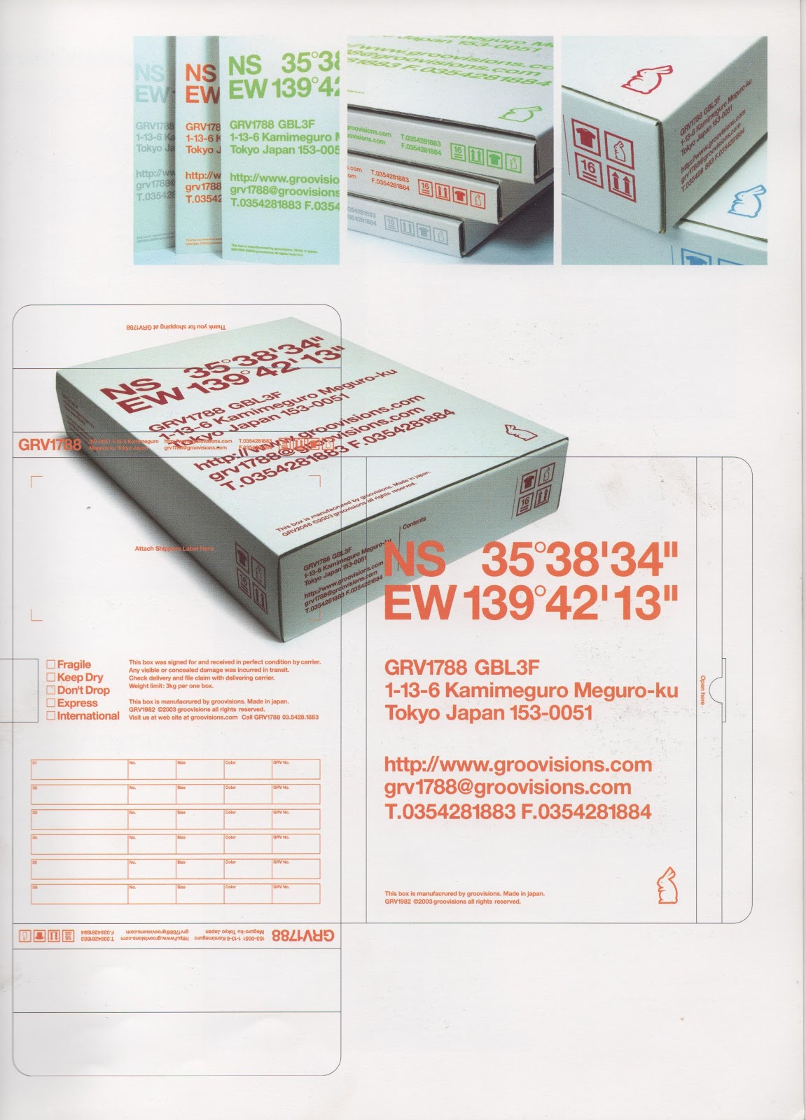
Next I collected research from two books.


1. (2005) 'It's a matter of Packaging' Index Book - 745.2

Page 50

This packaging has enough space for multiple elements, such as flyers, stickers and any other products. However, for it to be strong enough for the packaging to support all these elements it would need to be printed on thick corrugated card. This could be a problem as the printers at uni can only print on card to a certain thickness. 


Page 55

This packaging is relevant to my project as the dimensions are more suited to hold paper thin outcomes similar to what my group will produce. Furthermore, the design has tabs on the bottom on top, this stops paper from falling out the packaging when tipped upside down. I will experiment with using tabs to stop the outcomes of the project from falling out when producing my models.


Page 61

I chose to feature this product as it uses an outer sleeve to hold the all aspects of the project together. I also want to look at the possibility of creating an outer sleeve as it is an effective way of protecting the outcomes of the project.


Page 121


 Page 135


The second book that I used for my research focused on handmade packaging, the book has lots of bespoke storage techniques that I hope to experiment with when producing my  packaging.

2. Wiles R. (2012) 'Handmade Packaging Workshop' Thames & Hudson - 745.2

The above product uses tabs to hold the outcomes inside, similar to previous designs I have looked at. When making my model I will experiment with creating a similar style of packaging.


I collected further research from different internet sources. 

This product uses a band to hold the cover tightly shut. I could also experiment with making a band as an alternative to an outer sleeve.


Additionally, this product uses a bespoke string closing technique, if time was not an issue I would experiment further with different ways of closing my packaging. 

By layering a sheet of paper within my packaging I can create pockets in which the other outcomes can sit, similar to the example above. This is relevant to my project and could easily be replicated. 


Tuesday, 27 November 2012

CRITICAL POSITIONS ON ADVERTISING SEMINAR


Today, we had a seminar on advertising that focused on exposing the corrupt capitalist culture that is created by our society. I found the seminar thoroughly enjoyable, as this is a subject of personal interest. We discussed things such as the consumer culture in which we construct our identities from.  And the advertising techniques used to entice us into the commodity trap.

I personally believe that the consumer culture within which we live is wrong, despite being a participant myself.  This got me thinking about connections between advertising, culture and discrimination. It is not advertising that is responsible for the consumer culture in which we live, but modern society itself. Through the accumulation of products that citizens define their lives by, people create an elitist image of themselves, defined by what they own. Which in turn creates indifference and discrimination of people who either can’t afford to partake in commodity culture, or people who refuse to. It’s absurd to think that possessions and money define our position in society rather than our contribution to the community. This idea is created by big corporations and banks to alienate the poor, or individuals who refuse to partake in this consumer society, as they are of no financial benefit to them. As individuals we are trapped, prisoners to the culture in which we live. The prison guards who keep us trapped are not the big corporations and banks, but the majority of people who unknowingly partake in consumer culture.