Tuesday, 6 January 2015

CONTEXT OF PRACTICE 3 - DIGITAL DEVELOPMENT

Once I had finalised the concept, defined the specific details of the publication, finished my dissertation and defined the relevant design decisions, I was in a position to start the digital development process of the outcomes design.


CREATING ILLUSTRATIONS

The digital design process was started by first creating the title page illustrations. As the three main chapters that will be featured in the publication had previously been defined I was able to create illustrations relevant to each of the individual sections.
  • Capitalism and Climate change. 
  • The Transformational Festival Movement.  
  • Forming Networks/Facilitating Change. 

Due to the print method selected to produce the publication all images featured had to be edited and turned into single colour, halftone images. If this process was not completed before creating the final illustrations the images would not print correctly. 

To achieve the desired effect, the selected images were placed into Photoshop, had their colour discarded and were edited using the 'Colour Halftone' filter. 


Additional to the halftone images, I also created a range of vector based illustrations that had relevance to some of the visual themes outlined in the development stages of the project.


REDUCING SCREEN AMOUNT 

Reducing the amount of screens used to print the outcome will reduce the environmental impact of the physical piece. Therefore, as sustainability is one of the predominant focuses of the module, I decided that when printing the publication I will expose all of the individual illustrations on one screen. Exposing the screens in such a way not only reduced the amount of screens needed to produce the publication, but will allow me to build up layered illustrations by combining the individual illustrations. 


DESIGNING THE PUBLICATION   

After the illustrations had been created for the various aspects of the outcome I was able to progress with the digital development of the newspaper. The design process was quick as I had the rewritten body copy and illustrations ready to drop into the created layouts.

As previously outlined, I decided to utilise a small size for the publication to ensure it is easy for recipients to carry around and read on the go. Therefore, I had to set up a custom sized document that had pages slightly smaller than an A4 sheet of paper.


  • Infographics where created in illustrator to help readers visualise the statistical data presented within the text.  


Monday, 5 January 2015

CONTEXT OF PRACTICE 3 - PHYSICAL OUTCOME - PRINT METHOD

Another definitive aspect of the physical outcomes production is the print method that will be used to produce it. As it has been outlined throughout my blog posts, a predominant focus of the project is geared towards the concept of sustainability. Therefore, whatever print method is selected to produce the outcome must have the lowest environmental impact achievable.

FOOT PRINT WORKERS CO-OP -


Researching into sustainable print methods has lead me to have a base knowledge of the subject already. Moreover, in a previous project I visited the 'Footprinters Workers Co-op', an environmentally focused risograph printers based in Leeds.


The printers are my first choice for producing the publication as they print onto environmentally friendly papers made from FSC certified recycled paper using one of the most environmentally friendly printing techniques commercially available.


BENEFITS OF PRINTING WITH FOOTPRINT - 
  • Risograph uses vegetable based inks - no harmful chemicals or VOC's.
  • Print method has low environmental impact - relevant to module focuses.]
  • Print onto recycled, certified papers.
  • Ability to print in large runs.
  • Ability to print a range of colours.
  • Unique tactile finish to print method. 
  • Local business - no need to transport finished products long distances. 


PROBLEMS -

Unfortunately, I am unable to use the printers for a number of reasons which I have listed below;
  • Time - I would need to send the completed newspaper file to the printers in the next few days to have the outcome printed in time for the deadline. Although this is achievable, this is a very tight deadline that could affect the standard to which the outcome is produced.   
  • Cost - Currently, I am tight up on money and the printers require a minimum print run of 100 units which I cannot currently afford to purchase.  


DIGITAL PRINT COLLEGE - 

Another method I considered was printing using the digital printers available in the digital dungeon at college. However, after speaking with James, the print technician I discovered that the print method is far from sustainable and therefore an unsuitable choice for the project.


REASONS UNSUITABLE -

  • Lots of energy used by printers.
  • Inks used have lots of chemicals in them.
  • Inks used can affect the recyclability of the paper.


SCREEN PRINT - 

The only other print method I have access to that meets the required level of sustainability is screen printing, a process which I can complete using the college facilities. 

Screen printing is a suitable method as it is predominantly a human powered process that requires little energy once the screens have been exposed. Moreover, the method can be used to print relatively large print runs and allows me to build up layered translucent illustrations like the ones reviewed in my visual research. 

Despite the applicability of the method it is not a completely sustainable print method as harsh chemicals are used to wash and expose the screens which have possible environmental impacts if not disposed of correctly. Unfortunately, given the choices and time remaining to complete the project, there are no more suitable choices available. 


SCREEN PRINT INKS -

Another aspect of the screen printing process that has negative environmental impacts lies with the inks that are used to print. At university, acrylic ink is predominantly used within the process. Although such paints are water soluble, they are plastic based and contain VOC's (Volatile Organic Compounds) amongst other potentially harmful chemicals. 

To justify using the print method, I plan to purchase a more sustainable alternative to the plastic based acrylics on offer at university.   


ECO GREEN CRAFTS - ACRYLIC PAINT -

Research lead me to discover an eco-friendly acrylic paint alternative that is the perfect choice for printing my outcome in a low-impact way. 


Eco Green Crafts is the first environmental conscience company that has a complete line of eco-friendly art and craft supplies, one of the products they produce is an eco-friendly acrylic paint, which is the perfect paint choice for my outcome. 


ECO GREEN CRAFTS - ACRYLIC PAINT PROPERTIES -
  • Contain natural pigments.
  • No or low VOC's and safe preservatives.
  • Most paints in the range have no VOC's.
  • Some, such as the metallics and a select few vibrant colours do contain some VOC's however the count is as low as possible.
  • The entire range qualifies for the latest ASTM rating which is reserved for products that meet the most stringent requirements for safety and low VOC content.


ORDERING PAINT - 

After researching into the properties of the paints and establishing that they are a suitable choice of paint for the project I selected a number of colours using the colour pallet outlined in the design decisions element of the project. 


CONTEXT OF PRACTICE 3 - DESIGN DECISIONS

Before I could start progressing with the digital production of the physical outcome I first had to define the various design decisions such as;

  • Stock.
  • Print method.
  • Typefaces.
  • Colour Scheme.
  • Visual theme.
  • Form.

While making decisions relating to each individual section, I considered the content that will be featured in the book, the concept of sustainability, the audience & how to engage them and the environment in which the outcome will be distributed. 

Thinking about such considerations when defining the design decisions early on in the project is an important aspect of the design process, as it ensures that the outcome is informed and appeals to the outlined audience.


STOCK - 


As outlined on the previous blog post that evidenced the process of stock selection, it was concluded that the most appropriate choice paper is the newsprint available form university. 

After speaking to one of the people working at the library I ascertained that the paper is recycled and made from post consumer waste. Moreover, purchasing the stock from the library allows me to buy a specific number of sheets and reduce any waste from the production process, an option that is not available if purchasing paper form commercial suppliers.  

The stock has a light gsm, which is a common feature among newspaper publications helping to establish the theme the outcome aims to achieve. 


PRINT METHOD -

The print method selected to produce the newspaper is the process of screen printing; a low-impact printing technique that is predominantly human powered and has the ability to create large print runs. 

The versatile method was selected due to its low cost, low environmental impact and ability to create layered, semi-opaque illustrations to visually engage the audience.  

To further ensure that the selected method reaches the high level of sustainability required, a selection of vegetable based acrylic paints have been purchased that are free from the Volatile Organic Compounds (VOC's) that are commonplace in most acrylic paint.  


TYPEFACES - 

When selecting typefaces for the project I wanted to stray away from the hand rendered, tribal inspired fonts that are commonly used in the visual identities of most transformational events. Such fonts have a good display purpose, however, I find that the often the progressive letter forms inhibit legibility, something I want to avoid at all costs. 

To ensure that the selected typefaces still appeal to the interests of the primary audience, I want to select a bold, attention grabbing sans-serif typeface, which will be used for headings and subheadings. The typeface will often be displayed along side illustration which will help to appeal to the visual preferences of the audience while not sacrificing any legibility. 

The display typeface will be supported by an additional sans-serif typeface selected for its legibility at smaller sizes and visual cohesion with the primary font. 


PRIMARY TYPEFACE -

The primary typeface chosen for the project is called Colaba, an all caps display font with rounded edges. The font was selected as it is attention grabbing, easily legible and meets the criteria defined above.   


SECONDARY TYPEFACE - 

The secondary, supporting typeface is called Letter Gothic, and was selected as it mixes well with the primary font and is legible at a range of small sizes. 


COLOUR SCHEME - 

To appeal to the interests of the primary audience a colourful visual scheme is essential, as psychedelic inspired visual art is common place at most transformational events. When selecting a colour scheme it was this consideration which helped to define the final selection of colours used. 

The chosen colours, which are displayed below, take inspiration from the standard CMYK colour pallet used in most commercial printing. However, unlike the bright tones of a standard CMKY pallet, the the vibrancy of the colours is muted slightly to give them a more natural, earthy feel, an aspect that which will appeal to the interests of the audience and help to engage them with the content of the outcome. 


FORM/SIZE - 

Taking inspiration from the newspapers reviewed as part of my visual research I decided the most appropriate form the newspaper will be a small, handheld outcome that the can be easily transported and carried by the reader. As the paper will be disseminated at transformational festivals, its small size is appropriate and will not inhibit readers who need to travel or read the publication as they move around the festival. 


VISUAL THEME - 

The visual theme, specifically referring to the illustrations that will be featured in the outcome, will be inspired by the psychedelic art and graphics inherent to the transformational festival movement. Such visuals engage the primary audience and will help to create a more informed, relevant outcome. 

The image below displays the Boom Festival website, which is colourful and includes a range of intricate illustrations all of which have relevance to the themes and values encompassed at the event.  

When creating visuals I will create a spider diagram and outline a selection of relevant themes the illustrations will be based upon. 


Friday, 2 January 2015

CONTEXT OF PRACTICE 3 - QUESTIONNAIRE

As part of my primary research for the module I decided to create a questionnaire for people who have attended previous editions of Boom Festival. 

The aim of the survey is to ascertain a selection of views and opinions from people who have previously visited the festival so I can evidence whether they noticed and/or were affected by the transformation nature of the event and the philosophies so inherent to the festival itself. 

Unfortunately, attendants from Boom Festival come from all over the world, statistics from the 2014 edition indicated that attendants hailed from over 156 different countries, making it very challenging to disseminate the questionnaire to a broad range of people who attended the event.  

Despite the risk of potentially not gaining the responses needed to developed an informed insight from the survey results, I decided to create it anyway and use social media to try and gain the data needed. 


QUESTIONNAIRE QUESTIONS 


Undoubtedly, from my perspective, while at the festival the language that was most widely spoken and understood was English. Therefore, without the opportunity to get it accurately translated into other languages, I composed the whole survey in English in an attempt to communicate to the widest percentage of the audience. 

I started the process of developing the questions for my survey by going through my essay plan and reviewing the main topics covered within the transformational festival section of the investigation. By reviewing and outlining aspects of the study that would benefit with evidence collected form attendants insights I was able to define the questions focuses. 


Once I had outlined the main focuses for the attendant interviewed I started a process of development and refinement until I had a final set of relevant, usable questions.   


FINAL QUESTIONS 
  1. How old are you, what is your gender and where are you from?
  2. How many times have you attended Boom Festival?
  3. While at Boom Festival, what things did you find inspiring or influential? (for example this could be art, performances, the environment or people)
  4. While at Boom Festival, did you attend any of the workshops and/or attend the Liminal Village lecture programme?
  5. Did you learn or gain anything from the Boom Festival that will influence you outside of the festival environment? 
  6. If you answered yes to the last question, please explain what you learned and how it will affect you.
  7. How do you see events like Boom Festival evolving in future years?


QUESTIONNAIRE INTRODUCTION 

After developing a set of final questions I progressed by writing an introduction to the survey so possible participants could understand the context behind the questionnaire and have a rough estimation of how long it will take to complete.


INTRODUCTION - 

Note - This survey is specifically for people who have been to a previous edition of Boom Festival in Portugal. 

Firstly, thank you for taking the time to respond to the survey, the insights you will provide are essential in understanding the importance of ‘Transformational Festivals’ in modern society. 

A transformational festival is a definition used to describe countercultural events such as Boom Festival. Such events are founded on positive ethics like community-building, personal growth, respect for the environment, social responsibility, healthy living, and creative expression.

Information gathered from the results will be used to form an understanding of the impact that counter cultural festivals have on their participants, the surrounding areas, and related society. 

The survey asks a series of questions that should take around 5 minutes to complete. 

Finally, information is confidential so no name is required ensuring all responses will stay anonymous.


DISSEMINATION 

As previously outlined, members of the audience I want to address come from all over the world, and so unfortunately, there is no standard way of disseminating the survey to them other that through social media and forums. 

As the questionnaire is specifically designed for attendants of Boom Festival, I decided that the most appropriate area to disseminate the survey was on the events official facebook page. Luckily, the page is fairly active as the page organisers regularly post pictures and posts about the previous events which should help my survey to get seen.

I found three different pages for the festival on of which I was able to identify one as the 'official' page. Despite this, I posted the survey to all three pages to try and maximise the amount of responses the survey received. 


RESPONSES 

Unfortunately, over the time the survey was available for completion it got absolutely no responses.


The lack of results came as a real blow as I was certain that the survey would generate at least some usable information. Below, I listed some of the reasons I believe the questionnaire failed so that in future I can try to avoid the same problem.


PERCEIVED PROBLEMS -
  • Distributing surveys on the internet is fairly impersonal meaning people are more likely to avoid responding.
  • The survey introduction was quite long winded and could have put people off from responding. 
  • The questionnaire was posted to the events 'Posts to Page' section rather than its main wall - Perhaps people do not look at this aspect of the page very often.  


Saturday, 20 December 2014

CONTEXT OF PRACTICE 3 - INTERVIEW 1

As part of my primary research for the dissertation I wanted to conduct some in-depth participant interviews to establish how participants of Boom Festival were affected by the varying aspects of the event.
As my dissertation has a predominant focus on sustainability and the festival philosophies intrinsic to transformational events, the interview questions will be predominantly focused on discovering the whether the interviewees noticed and/or were affected by such festival elements.

Relevant information gathered from the interview will be used to support the opinions presented in the final chapter of the investigation.

INTERVIEWS

The first person I contacted regarding partaking in an interview is one of my old friends Joseph Peplow. He was one of the individuals I arranged to meet at Boom festival after he spent the weeks leading up to the event travelling through Europe in a lift share convoy from Amsterdam. 

For many reasons Joe is a perfect person to interview on the subject as, although like me it was his first time at a transformational event, he had an established knowledge of the counter-cultural movements taking place within the festival environment and the importance of the philosophies disseminated amongst participants. 

A few months after the event I was able to contact him through Facebook and ask whether he would be interested in helping me with my research. Contacting him was always hard as after the festival he went travelling through Portugal into Spain and down to Morocco. Therefore, when I wanted to speak to him I had to wait until the rare times he found wi-fi in the Morrocan countryside. However, despite such hardships, Joe was willing and able to help me out with my research, something I am greatly appreciative of. 

The messages below document the process of organising the interview. 


INTERVIEW RESPONSES 

The responses received from the interview are listed below;


1. How old are you, what is your gender and where are you from?
I am 21 years old, Male and am of the Earth. The line makers call the land of my birthplace the "United Kingdom".

2. While at Boom Festival, what things did you find inspiring or influential? (for example this could be art, performances, the environment or people)
The whole concept of the festival for me is massively inspiring. The harmonious blend of the influential and often undervalued cultures such as music, art, and spirituality, moulded in such a glorious and tranquil environment, founded on sustainable philosophies and altruistic ideologies, all unfolding in such a caring and loving manor, was a wonder to be immersed in! Very much different to some of the more commercial festivals I have been to. A joy to behold sustainability being promoted over profitability, conscience over consumption.

3. While at Boom Festival, did you attend any of the workshops and/or attend the Liminal Village lecture programme?
Aside from the holistic pleasures being offered at Boom my main indulgences were the diverse variety of lectures being delivered in the liminal village. They caught my attention due to the wide, and often contreversial, range of subjects being discussed. From the fundamental philosophies of both the festival organiser, and goer. To the influence of psychoactive substances on music culture, art and wider society. I massively enjoyed the interactive discussions that derived some phenomenal and heart-warming perspectives  from some of the most influential artists, performers and event organisers in modern transformational festival culture. It was great to see this form of interaction being represented at Boom, and even more so that it was far more organised than anything of the like that I have experienced at other events. 

4. How important do you think the educational/skill sharing aspect of the event is?
For me it was incredible to witness such a unique convergence of educational and liesurable activities. The commitment to education being integral to the festivals raison d'etre, is valiant and awe insiring. At all times there was something magical taking place in a context outside of what mainstream society might consider valuable. The opportunity to engage with activities and subjects such as meditation and psychedelic drugs, that are often brushed under the carpet by more conventional paradigms, is a highlight of Booms alternative attractions and of unimaginable benefit to both the participant and wider society. The promotion of vivacious discussion on topics unperscribed by the narratives of capitalist society is essential in a time when freedom of speech is being diminished within mainstream media, and alternative perspectives on how we can lead our lives are being met with increasing hostility by those who are attempting to clutch the straws of a dying paradigm that promotes mindless consumerism and the waste of resources for personal profit, over fair distribution and sustainable resource management, and is an invaluable weapon for exsposing and resolving the injustices and fallacies of the capitalist world.

5. What did you learn or gain from attending Boom Festival and will this influence you outside of the festival environment? (if you did learn something please explain)
For myself, the festival was more an opportunity to ground, consolidate and expand upon some of my own pre-existing ideologies and philosophies about life the universe... and everything, that in mainstream society are considered peculiar and sometimes ridiculed, but at places such as Boom are on the tip of everyone’s tongues and are openly and respectfully discussed. Helping me to reaffirm my own assurances, and interact with people of similar persuations. In a similar way to a heroic psychedelic experience, the experience of Boom is not one of unearthing some ancient universal secret, but more of unveiling, accepting, rejoicing and catalysing the fundamental understanding and appreciation of life and the universes nature of oneness, harmony, creation and sharing. The awareness of these truths exists already within our own conscious perception, and events like Boom, in the same way as psychedelics, are helping those who indulge to uncover, resonate with, embrace, embody and expand upon their perception of this existential fundamental, and its benefits to the evolution of consciousness and human society, whilst other external forces seek to have them ignore it.

6. What do you see in the future for events like Boom Festival? (growth points, festival evolution ect)

I see only big wonderful things, in bright and beautiful places, with inspirational and loveable people for anything offering even a remotely similar deliverance of the principles demonstrated at Boom. For me I envisage a transition from these events being on the edge of societal culture to a point where they are merged seamlessly, sustainably and unstoppably into the traditional way of life. Where festivals run year round, blending the holistic pleasures with the more undesirable aspects of sustainable living into a package marketed in a manner that makes the old paradigm of mindless consumerism seem unpalatable and redundant to even the most stubborn and catacombed mind. Transformational Festivals are Spartacus. 

Thursday, 18 December 2014

CONTEXT OF PRACTICE 3 - PHYSICAL OUTCOME - VISUAL RESEARCH

After defining a final idea for the physical outcome I progressed towards the initial design decision stages of the project by collecting a body of visual research reviewing similar newspaper style publications. 

The reasons for collecting a body of visual research are listed below.

RESEARCH RELEVANCE -

  • Inspiration.
  • Review current newspaper design.
  • Assess the varying forms of publications.
  • Review stock choices.
  • Review colour usage.


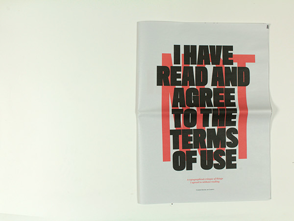
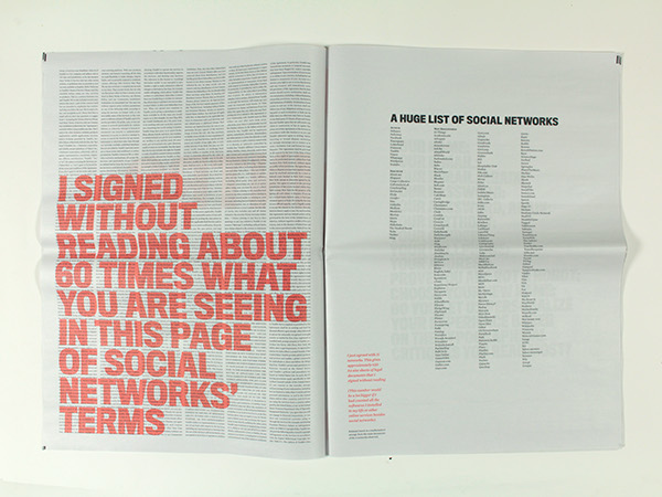
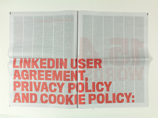
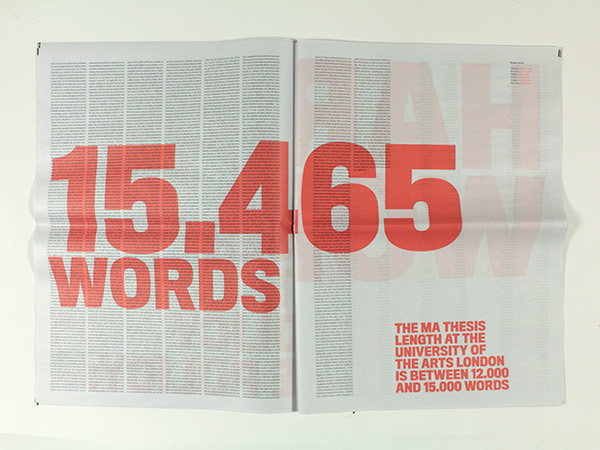
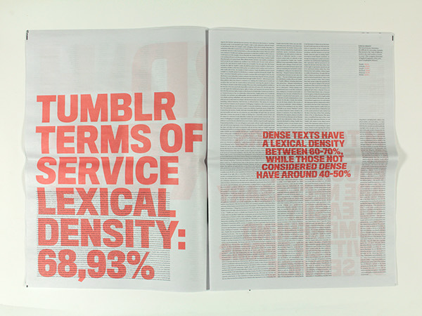
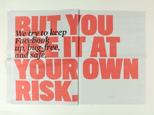
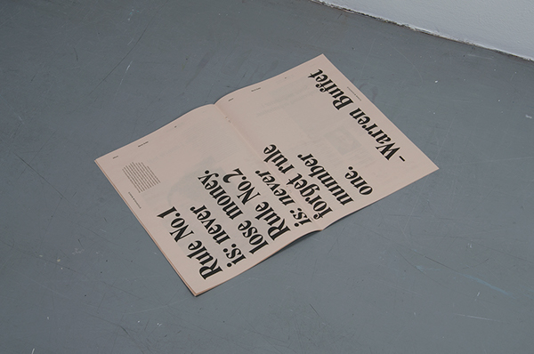
I have NOT read and agree to the terms of use - Cleber Rafael de Campos

Project Description - A typographical critique of things the author agrees to without reading.


Project Link - Link

ANALYSIS - 
  • Two colours used - Simple and effective use of colour.
  • Large text - Application of large coloured text grabs attention and immediately communicates information. 
  • Aspects of paper not always legible due to overlaying aspects of typography. 


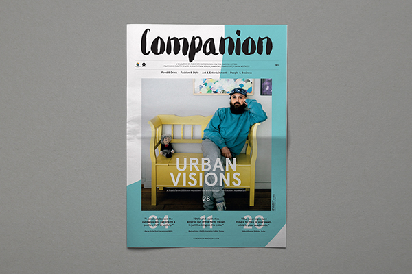
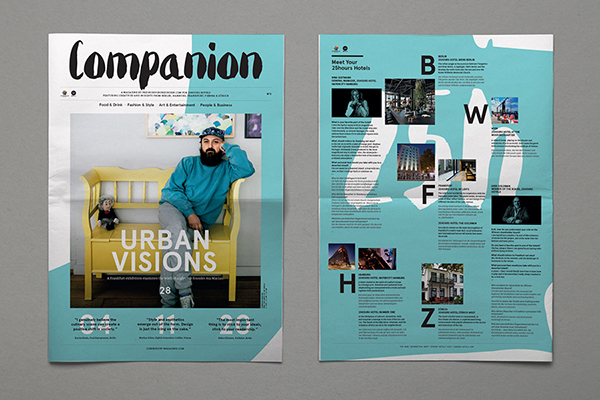
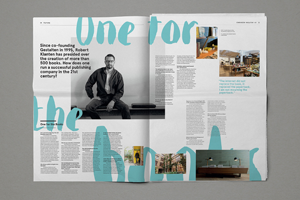
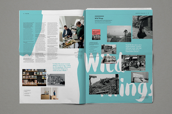
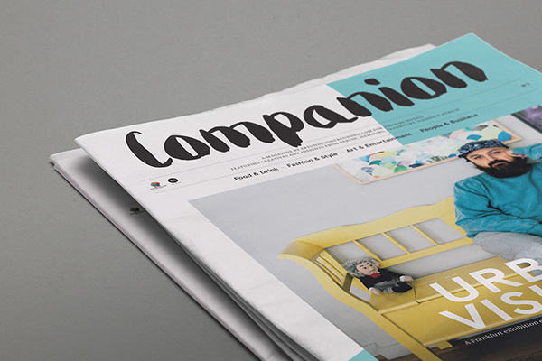
Companion No.2 - Chloe Galea

Project Description - Companion Magazine is a publication by Freunde von Freunden for 25Hours Hotels offering insight into the life and work of creatives living in the cities of Berlin, Hamburg, Frankfurt, Vienna and Zurich.


Project Link - Link

ANALYSIS - 
  • Images printed full colour.
  • Two main colours used for rest of publications design.
  • Vibrant use of colour engages reader and keeps them interested in the publications content. 
  • The effective use of typography and visual elements create an aesthetically engaging outcome. 
  • Layouts guide readers eyes across the pages composition effectively.  


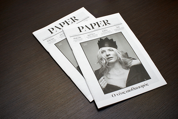
Paper Magazine No. 40 - Manos Daskalakis 

Project Description -  Paper magazine No.40, created as a supplement to Imerisia, the Athens based Financial Newspaper.


Project Link - Link

ANALYSIS - 
  • Magazine size - Useful choice of form for the outcome that helps to make it portable.
  • Effective balance of images and content - visuals help keep reader engaged. 
  • The limited use of colour helps outcome be more sustainable although this is not a decision purposely made by producers of the magazine.   


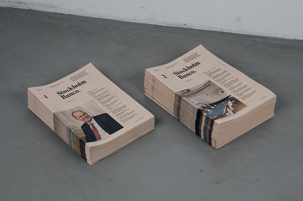
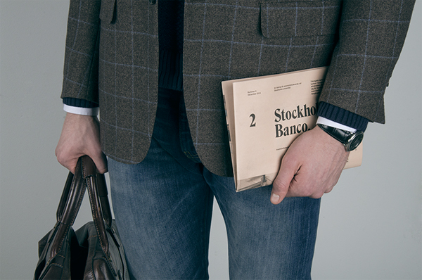
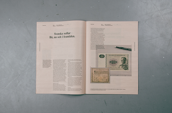
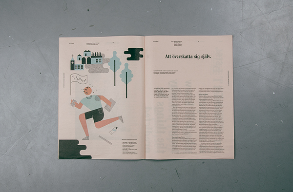
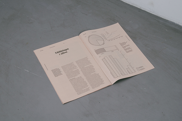
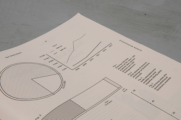
Stockholm Banco - Simon Jung Krestesen & Oskar Pernefeldt

Project Description - Stockholm University did not have a school magazine for their economy students which lead to students taking the problem into their own hands. The result of their endeavors is Stockholm Banco, an economics newspaper created by students for students.  


Project Link - Link

ANALYSIS - 
  • Use of colour is limited to the illustrations and images - reduced environmental impact of production and printing costs. 
  • Publication size - Useful choice of form allows the outcome to be portable and eases reading while on the move.
  • Strong use of grid based layouts applied throughout outcome to form a range of engaging page compositions.
  • The off white paper stock used as part of the outcome stands out from the stocks used by publications previously looked at.
  • Strong use of infographics to communicate statistical data - engages viewer with content heavy information.  


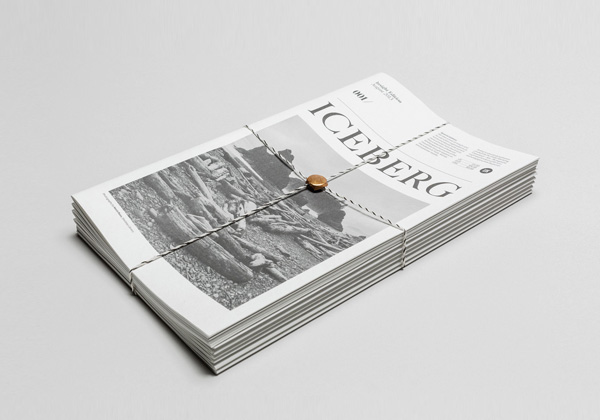
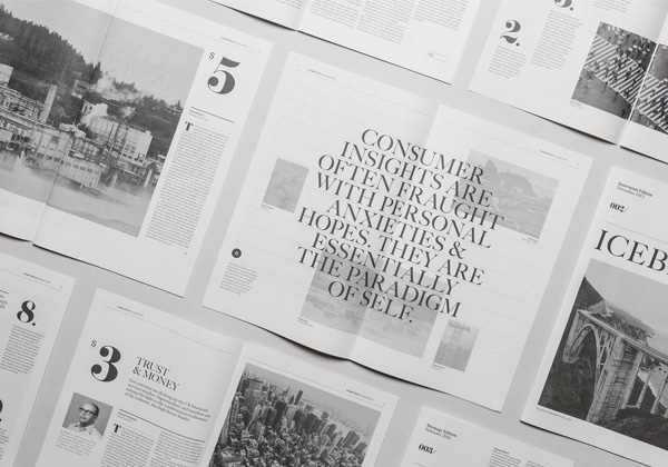
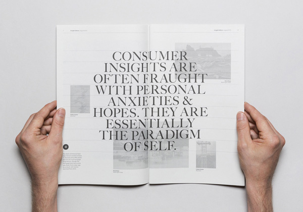
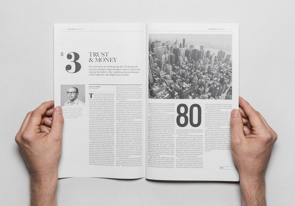
Iceberg - Socio Design

Project Description - Iceberg is a quarterly publication produced for KAE, which was named, designed and produced by Socio Design in London.


Project Link - Link

ANALYSIS - 

    • Page compositions - Layouts create a harmonious balance between written content and imagery.
    • Limited use of colour - The publication is printed in black and white, reducing its environmental impact and its cost of production.  
    • Publication size - Useful choice of form allows the outcome to be portable and eases reading while on the move.


    Nya Upplagan

    Project Description - Music based newspaper produced and distributed in Sweden.


    Project Link - Link

    ANALYSIS - 


      • Vibrant use of colour on the cover of the newspaper is engaging and invites readers to pick the publication up. 
      • The print technique used to produce the publication allows for the overprinting of images and illustrations which creates some really engaging visual effects. 
      • The use of negative space helps to balance the pages and ensures they don't appear too busy.  


      APPLICABLE ASPECTS - 

      After reviewing and analysing the design from a range of similar newspaper based publications I progressed with the project by reviewing my analysis of each one and selecting aspects that have a relevance and a possible application to my outcome. 


      APPLICABLE ELEMENTS -
      • Large text - Application of large coloured text grabs attention and immediately communicates information.
      • Vibrancy - Vibrant use of colour engages reader and keeps them interested in the publications content. 
      • Layouts guide readers eyes across the pages composition effectively.  
      • Limit use of colour - Use of colour is limited to the illustrations and images - reduced environmental impact of production and printing costs. 
      • Publication size - Useful choice of form allows the outcome to be portable and eases reading while on the move.
      • Infographics - use of infographics to communicate statistical data - engages viewer with content heavy information.
      • Print technique - The print technique used to produce the publication allows for the overprinting of images and illustrations which creates some really engaging visual effects.