INITIAL RESEARCH - SURVEY - PRIMARY
Firstly, I will conduct a survey to find out if students think ice breaking games are helpful, and a useful way of getting to know people in the class.
ANALYSIS
The results collected from the survey show that although the participants found ice breaking games a good way of meeting new people with similar interests, they did not necessarily enjoy them.
For my outcome I will produce an icebreaking game, I need to think about how I can make my game engaging for students as I want my outcome to be enjoyed. When defining the rules of the game I will design them so the game is fast paced and fun.
VISUAL RESEARCH - SECONDARY
I have defined my concept as a game where participants randomly select a card with a word or phrase on it, they then have communicate the word by drawing it. This is similar to a game called charades however the phrase or word is acted instead of drawn. I started my research by collecting information on charades, the rules involved and the equipment that is needed to play it.
- The above rules can act as a guide when it comes to writing the rules for my game.
- Important information is given about what is needed to play such as an egg timer and a pack of topic cards. (I will need to buy an egg timer for my game.)
- What will the objective be of my game? (should it be points based, will there be a prize?)
http://pinterest.com/pin/261279215853332379/
- This image shows a full charades set.
- I could create a similar package as my final outcome.
- If I want to produce an outcome like this I will need to design the cards, packaging for the cards, rules leaflet and box to hold it all.
- This product has experimented with form, instead of cards the words and phrases are printed on wooden lollipop sticks, I could consider experimenting with form if it makes the pack more aesthetically engaging.
- This product has packaging in which all the elements fit within.
- I want to produce packaging similar to this to hold the elements of my outcome.
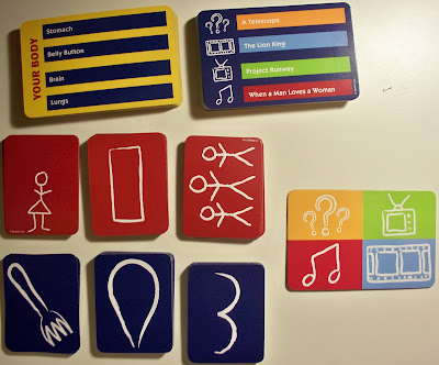
As my research progressed I discovered games that had very similar concepts to mine such as 'Pictionary' and 'Draw Something'. In both of these games the participant selects a card with a phrase on it, the phrase is then drawn and the other members of the group must guess what the phrase is.
- Pictionary is different to charades because you draw the phrase or word and work your way around a game board. My outcome will be a mix between them both.
- The kit also comes with an egg timer, this seems to be a common feature across both pictionary and charades games.
- The kit includes paper for drawing on, what will my kit provide to draw on? (dose it need to provide paper?)
- The rules for Pictionary are very similar to the rules of charades, but the outcome is draw just like in my game.
- There are 500 cards in total, which includes four category cards. (what could my category's be?)
- These are the outcomes from a game of pictionary.
- Participants have to think about how they will visually communicate the selected word which improves communication skills.
- Additionally, the drawing is then presented to the group so they can try guess what word it is causing members of the group to interact.
- This set comes with a whiteboard to draw on, I like this concept as it saves paper and helps the environment.
- It has made me consider what I will supply with my kit to draw on.
- Moreover, It also comes with a pen, will I put pencils/pens in my kit?
- This set comes with pencils, an egg timer rules and cards. (My outcome will have all these aspects.)
- The packaging has been designed so that the elements neatly sit in it, I want to produce something similar for my packaging.
After collecting this initial body of research I felt informed enough to develop my concept and write my proposal statement.
FURTHER RESEARCH - SECONDARY
After writing my proposal statement I started collecting focused research into existing packaging and card design.
I started by finding out the dimensions of a standard poker playing card.
The two most common sizes of playing cards are:
- Poker Size (2 ½" × 3 ½", 63mm × 88mm, ISO 216: B8)
- Bridge Size (2 ¼" × 3 ½", 56mm x 88mm)
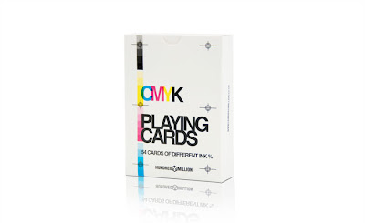
Next, I found a magic website called Dan & Dave, in their shop that have a variety of high quality playing cards. Although they are not specifically pictionary or charades cards I am looking at design elements such as the back, and the type of stock the are printed on.


http://pinterest.com/pin/322570392030373901/
- This image shows two sets of playing cards in a custom made box.
- The designs on the playing card packaging is very simple and quite boring.
- I want my box to hold the aspects of the project in a similar to this design.
- The above playing card packaging is really aesthetically engaging due to its intricate design, and high quality finish.
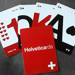
http://www.coolastenbears.com/typographic-graphic-card-decks-318
- These small cards show examples of different fonts as well as providing a small amount of information.
- I like the layout of the card as there is a clear use of type hierarchy.
- The above images show a range of screen printed business cards.
- The cards have rounded edges.
- They also are longer than playing cards. However, I don't see how a card this size would be beneficial.
- The design on these greeting cards has been screen-printed.
- I will consider scree-printing as a production method, as the cards and packaging could be printed this way.
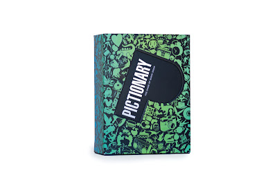
- Pictionary redesigned by Garren Lofgreen Design
- The packaging is much more engaging, it now features interesting illustrations relevant to the pictures that would be drawn playing the game.
- Rules and instructions are featured on the underneath of the box, this will save money as they were previously printed on a separate piece of paper.
- I could also print the rules onto a part of the packaging to save printing it separately on paper.
- Above is an example of the current cards used in pictionary, as they are designed for families the graphics are very simple and quite formal.
- The cards for my game are being created for first year graphic designers so need to be visually engaging.
- In this image shows the back designs of some old playing cards. They are very decorative and are created out of intricate patterns.
- Most of the cards have a boarder where the design finishes.
- I need to start thinking about the style of deign I will have on the back of my cards and how this will affect the rest of my packaging.
PLAYING CARD RESEARCH - PRIMARY
I collected primary research into playing cards by looking at 'Family Charades', a game where people communicate phrases and words by acting the answer. When reviewing the game I looked at the packaging, its functionality and production and the design of the card and how the information was composed.
Firstly, the graphics created for the packaging are relatively simple, the bold colours are used to grab the audiences attention and appeal to children and the main typeface chosen grabs attention and is legible from a distance.
I hadn't encountered packaging like this before the top of the box is left slightly open, so that cards can be taken out. I think that the packaging has been badly designed, as an open top means that cards can fall out freely as they are not contained.

The cards themselves are also shaped in an unusual way, with curved sides the card fits into the shape of the hand comfortably. This has made me think about the shape of my cards and how they will interact with the audience.
Finally, the information on the cards has been simply composed centrally on the card.
PACKAGING RESEARCH - SECONDARY
Furthermore, I also collected research regarding the packaging that will contain the elements of the game. The packaging will need to protect the elements of the game stored within and visually engage the audience.
- Thin, two walled corrugated cardboard has used for this t-shirt box designed for carhartt. My outcome could also use a stock similar to this, the material can be folded easily making it a good stock choice to work with.
- These outcomes have been printed onto a thin cardboard, the material is not as thick as the double sided corrugated cardboard first looked at so may not be as durable. The packaging of the outcome needs to be sturdy and durable as it needs to be able to endure standard wear and tear.
- Finally, I featured this box as it uses recycled material and uses a similar closing method as I want my outcome to use.
- I believe that making my outcome environmentally aware is important, looking after the environment is something that is in my personal interest. When choosing a stock I will look for recycled material even if it costs slightly more money.
Furthermore, I wanted to collect research from sources other than the internet. So, I also collected packaging research from a book called 'Handmade Packaging Workshop' by Rachel Wiles.
- 'Allotinabox' design created by ilovedust.
- The kit was created to get people to grow their own fruit & vegetables.
- Mixes different typefaces to represent the found/used items that people use to make their allotments individual.
- Hand printed to referrer to 'Hands on' approach to gardening.
- I really like the small the seed packets that are placed within the box. They are simple using only one colour and the stock, but are still aesthetically engaging.
- The seed packets have inspired me to consider different methods of printing.
- My cards need to be aesthetically engaging as they are being designed for first year graphic design students. Using a printing method such as letterpress or screen-printing would make the cards engaging for the target audience.
- Matchbox designs created by 'Little & Company'
- Designed as a holiday greeting card, the matchbox has a message underneath the matches.
- Vintage styled graphics work as a series and complement each other.
- This project has inspired me, I stated in my proposal that I will produce packaging for my set of cards to keep them together and tidy. So, instead of creating normal packaging standard of playing cards I could design matchbox packaging.
- Moreover, similar to this design I could print on the inside of the box the set of rules that will accompany the game.
- Box design created by 'Office'.
- Created in accordance with Ebay's visual language.
- Designed to be reused, saves a lot of energy and resources.
- This project made me think about the durability of my outcome. What stock will I print on? How will the outcome last? Will people keep it? (People will keep it if the game is fun and the design is aesthetically engaging)
OUTER PACKAGING DESIGN
Finally, I researched into different box templates that my outer packaging could use.
- The above design uses double walled corrugated cardboard, the same material I plan to use.
- I will create a box similar to this example, the box folds in on itself so no glue is needed to hold it together.
- The box uses a simple method to hold it closed.
- I featured this design because of the method used to hold the contents of the packaging.
- The box uses a raised cardboard sheet to hold the contents in place. The shape of the contents has been cut into the sheet with the tabs pushed inwards to the base of the packaging, this creates a space where the design element can then sit.
- Finally, in the back of the book I found various templates, the example shown above makes a similar box to the one I want to produce for my outcome. However, the box needs the application of glue to hold it together, my box won't need to use glue to bind it.
PACKAGING RESEARCH - PRIMARY
I collected primary research into packaging for my outcome by ordering a 'graze' box. Graze is basically a company that send out healthy snacks in the post, the packaging they use is particularly engaging and relevant to my outcome.
Firstly, all cardboard used to make the packaging is recycled and is recyclable, meaning that it is environmentally friendly. Ethics like this are becoming increasingly important to people in modern society, and is something that is also in my personal interest to promote. The packaging I create will be recyclable and labeled with the according semiotics to inform the audience that the product is completely recyclable.
The box has been made out of a thin brown card which has worked well as a material for the packaging. However, the box has warped slightly, and seems a little flimsy, I think the box wouldn't be durable enough to withstand daily use. I will consider using a thicker stock for my outcome.
The logo has been scaled and placed in a position on the lid of the box that creates a lot of negative space. The simple design is engaging and focuses the audiences attention on the logo, I want to use a similar technique when creating my box.
These are the compartments used to hold the small trays of food, my outcome will use a similar technique to hold the cards and timer.
Furthermore, the box uses no glue, but instead holds itself together. Additionally, the base of the box has been printed with an image of grass, this is relevant to the ethos of graze as a company and is a nice touch. Paying attention to small details like this make packaging more engaging.
Finally, the inside lid also has a really engaging print. This is a prime place to print on the packaging as it is one of the main points of focus when the viewer opens the box. I need to consider what I will print on the inside lid of my packaging as it is a prime place to display information.
PLAYING CARD BACK RESEARCH - SECONDARY
Moreover, I also collected a body of visual research into different patterns as I will be creating a pattern design for the back of the cards. I want the design to be aesthetically engaging similar to the cards I looked at in my further research, but have a contemporary feel. I found designing similar to this on a website called '1973' which can be seen below.
- Although this pattern is engaging my design will use a one colour print.
Mock Game - Primary Research
After I finalised the rules and contents of my game I created a mock version for a small group of people to play. The aim of this is to test and see if the game is understandable and if the rules are suitable. Hopefully any problems with the games content will come to light enabling me to refined them before production.
Unfortunately I forgot to put the memory card into my camera before setting off so was unable to photograph the session, however I did bring back some of the drawings that were produced.
Playing the game was fun, and enabled me to see how it well it worked when being played by a small group of people.
I was slightly nervous that we would encounter a problem when playing the game regarding the rules or how the game worked. However, all participants understood the concept due to the clarity of the rules so no problems were found with the games concept. Everyone agreed that the game was fun, and acted as a good introduction to each other.
The only negative feedback I received highlighted that if the participants knew each other previous to playing the game, then the game would be pointless as they would know the majority of the answers. However, the game is aimed at people who know nothing about each other so this shouldn't be a problem.


No comments:
Post a Comment