Work examples were collected from secondary internet based sources.
WHY FEATURED;
- The length of the leaflet allows for a good balance of aesthetics and information.
- A similar length leaflet could be utilised for my outcome.
This is England ’86 | The Church of London – Creative Agency
WHY FEATURED;
- The fold out form of this leaflet allows plenty of room for a balance of information and imagery.
- To read all information the leaflet must be opened completely, this could affect the delivery of information as space and the right environment is needed to do so.
ALVA ALVA - flyer
- Striking colours make the flyer eye-catching and interesting.
- A vibrant colour scheme could be utilised by my outcome to relate to the child based target audience and the often colourful aesthetic of commercial products.
STEPHANE PIANACCI - Occupy Wall-street Leaflet
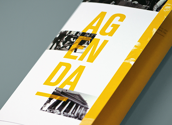
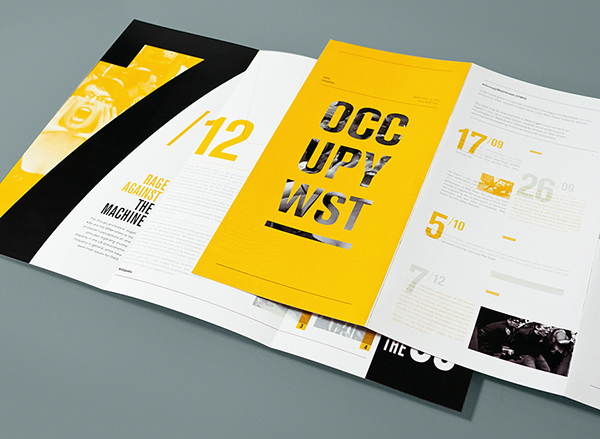
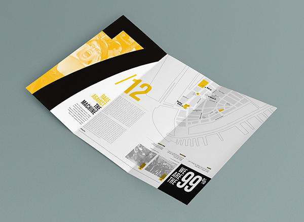
WHY FEATURED;


- The chosen form for this leaflet makes it very practical and allows a good amount of space for a balance of information and imagery.
- I could utilise a similar form for my outcome to make it suitable for the target audience who will be on the move or outside while engaging with the flyer.
DAVIDE GIOACCHINI - Leaflet design.
WHY FEATURED;
- Unusual opening method creates uneven panels.
- Interesting design invites the user to explore its contents.
Vespa Brochure
WHY FEATURED;
- Leaflet includes packaging.
- Packaging could be relevant to my design as it communicates information to parents about consumerism.
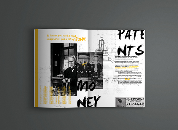
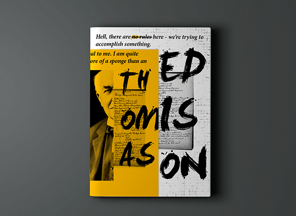
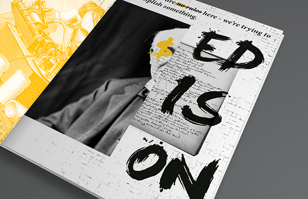
MARISA PASSOS - Edison Booklet


WHY FEATURED;
- Outcome could also take the form of a small booklet.
- A booklet is still suitable for the target audience and would leave sapce for a lot of information and imagery relevant to the subject.


I recommend Brochure Design Service as I had to do a brochure for a commercial advisor in the past and they did a great job. You can call him to 1-888-289-3861
ReplyDelete