Thursday, 15 May 2014

PPP2 - STUDIO BRIEF 3 - LLP RESEARCH

After reviewing my notes taken in the various PPP business sessions with John I realised that we had not collected research into ways to protect our business if it was to ever go bell-up and bankrupt. 

If we did not have any protection in place and the company went bust the three founding members of the company (me, Leo & Jamie) could potentially be held personally accountable for any business depts incurred by the company. The end result of which could be the seizure of our personal assets by bank employed, court ordered bailiffs. 

To overcome this problem I started collecting research into Limited Liability Partnerships, something that John informed us briefly about in session. 


LIMITED LIABILITY PARTNERSHIPS.


  • A limited liability partnership reduces personal responsibility for business dept.
  • Unlike members of ordinary partnerships the LLP is responsible for any debts that are run up, not the individual partners. 
  • For accounting periods starting on or after 06 April 3008 the time allowed for filling accounts at Companies House has been reduced from 10 months to 9. 


  • An LLP is an alternative business vehicle that gives the benefits of Limited Liability but allows its members the flexibility of organising their own internal structure.
  • The LLP will be responsible for the full extent of its assets so the liability of others is limited. 
  • Any new or existing firm of two or more persons can apply for an LLP.
  • The LLP legislation does not allow for a conversion process.
  • LLp's are required to provide financial information equivalent to that of companies, including the filing of annual accounts.
  • LLP's will also need to file an annual return, notify of any changes to LLP membership, notify any changes to members names or residential addresses & notify of any changes to their registered office address.


  • Registration electronically of an LLP on its incorporation of the 2000 act is £14.
  • Registration on paper of an LLP on its incorporation of the 2000 act is £40.


CONCLUSION


After reviewing the information and relaying it back to members of the group it was decided it is in our best interests as a small company to enter into an LLP to protect us from any prosecution if the company ever goes bust. 


Monday, 5 May 2014

PPP2 - STUDIO BRIEF 2 - AESTHETIC RESEARCH

After receiving the brief and generating some quick ideas with regards as to what will be produced as part of the identity I started collecting some secondary aesthetic research. The aim and function of the research is to...


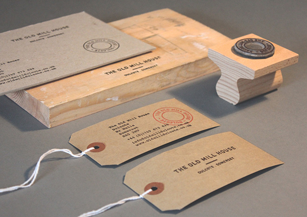
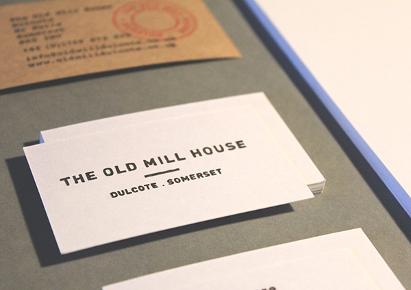
Josh Robinson - The Old Mill House.


WHY FEATURED;
  • Stamp based icon can be easily applied to multiple aspects of the outcome.
  • The hand rendered style of typography reminds me of craft and hand produced outcomes - something similar would form a good representation of me.


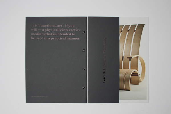
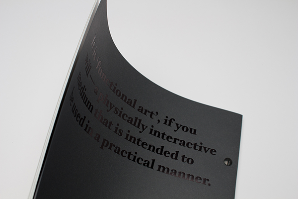
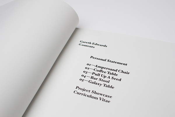
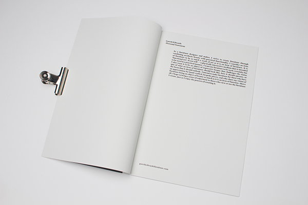
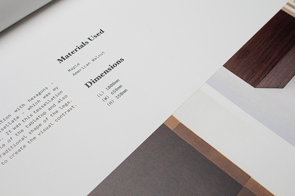
Passport - Gareth Edwards personal identity.


WHY FEATURED;


  • Portfolio booklet introduces viewers to the carpenter and also showcases some of his projects - something like this would hold relevance to my outcome as I need an outcome to introduce me to possible clients/employers that also simultaneously displays some examples of my strongest projects. 
  • Monospaced typeface used for the body copy in the book has a simple form, is legible and helps to form a professional aesthetic. 


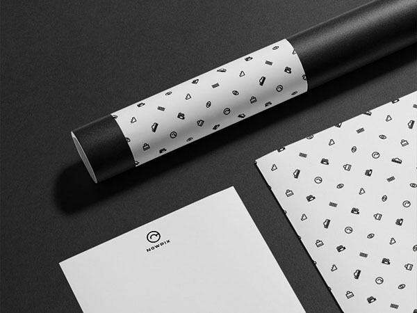
Marco Oggian - NowPix Branding. 


WHY FEATURED;


  • A pattern relevant to the rest of the branding aesthetics has been created and applied to various aspects of the outcomes. The simple pattern helps to form an interesting visual aspect for an otherwise minimal project.
  • Additionally, the letterhead has been printed on both sides, on its reverse the pattern is featured which I found to be a really interesting feature of the project - I will utilise a similar idea when creating my outcome.  


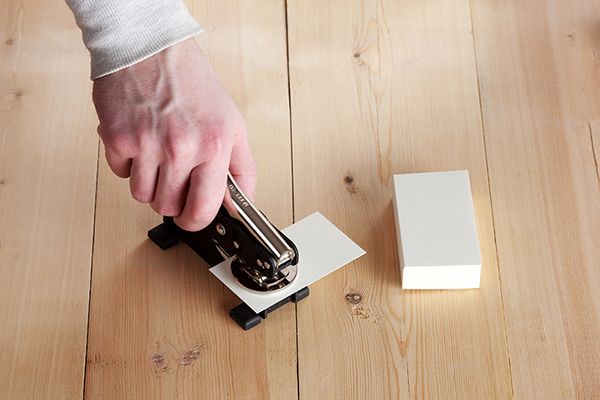
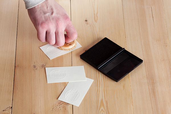
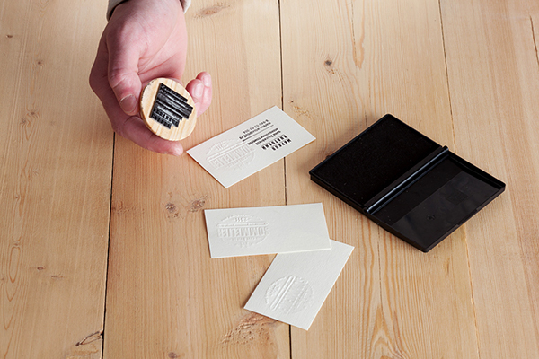
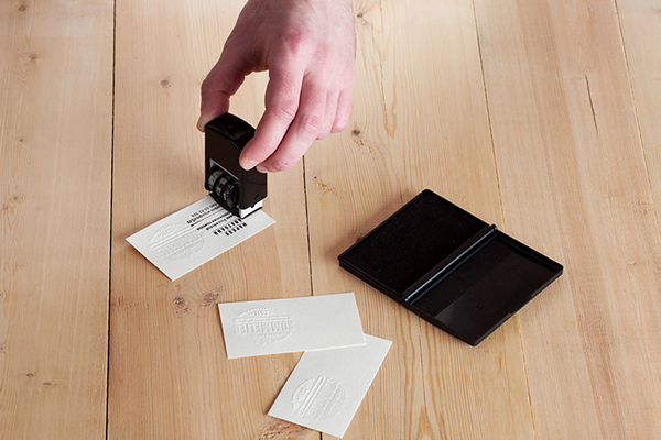
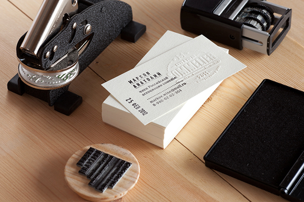
Pavel Emelyanov - Sommelier Markov Anatoly.


WHY FEATURED;

  • The stamps and embossing plate remove the need for any printing - environmentally friendly business cards could easily be created using this method. 
  • I could use the same method displayed above combined with some naturally coloured recycled stock to create a set of sustainable, aesthetically engaging  business cards relevant to my practice.  


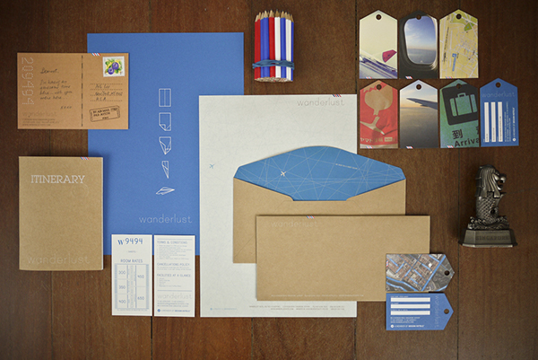
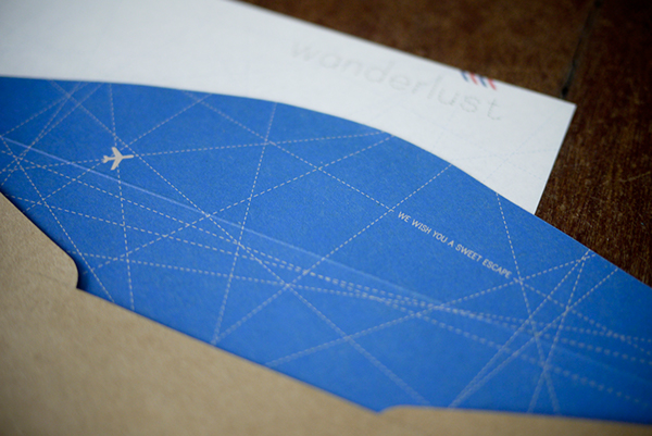
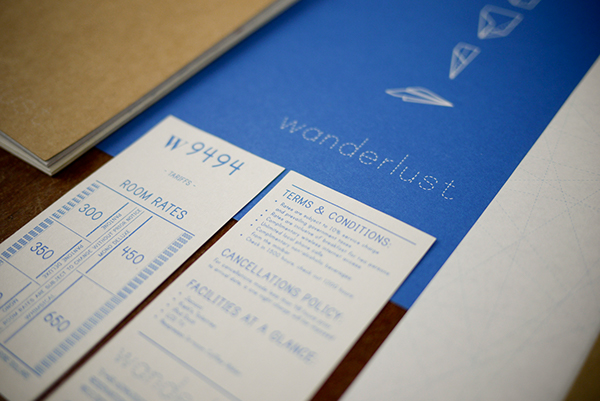
Foreign Policy - Wanderlust.


WHY FEATURED;


  • Simple refined colour scheme helps to form a cohesive engaging outcome.
  • Good range of relevant design outcomes - I will need to consider what outcomes are relevant to  my personal branding. Ideally I would like to produce a wide range of outcomes similar to the project displayed above. 
  • Additionally, when presenting the project the designer has also chosen to feature additional aesthetic elements relevant to the projects context such as pencils a statue - When photographing my work I will also feature contextualising elements to give my project further relevance and to add an additional visual aspect. 


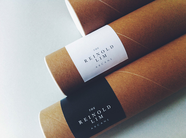
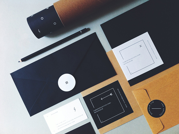
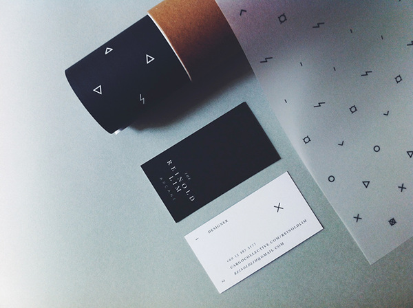
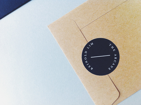
Oddds - The Arcane 


WHY FEATURED;


  • The natural colour of the brown stock used is something I am aspiring to apply to my project.
  • The postal tube also has the addition of a branded sticker, as I am planning to include a postal tube as part of my outcome I will consider producing a similar outcome featuring my branding and client address.
  • Finally, the envelop is also sealed shut with a sticker, this holds the envelope closed and acts like a letter seal - I really like this concept as it adds an interesting aspect to the letter and shows  the contents have not been tampered with.


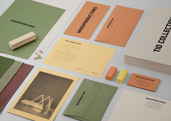
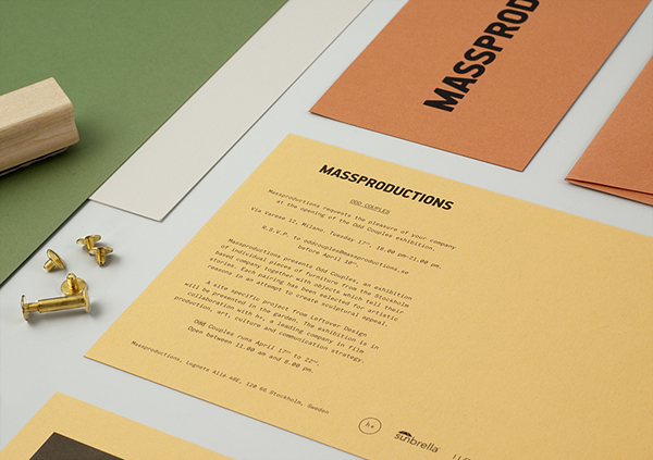
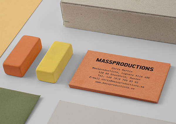
Britton Britton - Massproductions - Graphic Identity. 


WHY FEATURED;


  • Again, this project showcases a good, coherent stock selection, although the colours are far from what I want to utilise the project showcases the impact that I want to achieve.
  • Additionally, the gridded presentation of the project elements is also something I want to replicate when photographing my outcome. 


Alexandra Whitter - Recycled business cards.

Recycled Personal Identity


WHY FEATURED;


  • The recycled grey card stock the business cards are printed onto is the exact type of stock I want to utilise when creating my personal business cards.
  • The natural colour of the stock will form a nice cohesive aesthetic with the other naturally colours stocks with brown and light grey tones. 
  • Additionally, I could also edge paint the business cards using a DIY technique similar to the one that has been ustilised to produce the business cards displayed above. 


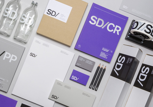
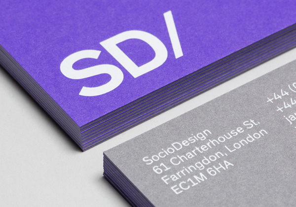
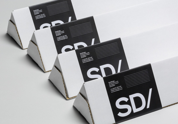
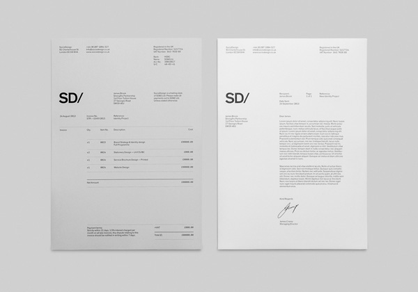
Socio Design - Self Branding. 


WHY FEATURED;

  • The consistency of visual elements in this project help to form an engaging, recogniseable company identity for Socio Design - when creating my outcome I will apply visual elements consistently across all design elements to help form a strong aesthetic.
  • Additionally, the postal tubes utilised by the company are triangular shaped, this is interesting as I have not seen this style of postal tube before. 


Jonathan Shackleton - Personal Identity.


WHY FEATURED;


  • Consistent visuals such as the logo and refined stock choices help to create a strong, visually engaging branding project that  screams professionalism.
  • Contrasting colours of the stocks help to form an interesting visual aspect for the project - I could recreate a similar contrast between the naturally colours stocks I want to utilsie.