Josh Robinson - The Old Mill House.
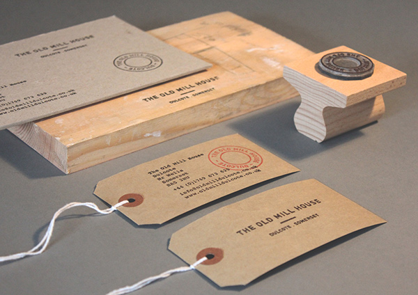

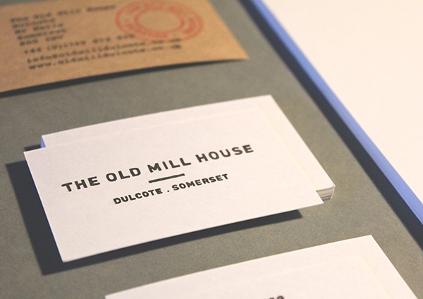
WHY FEATURED;
- Stamp based icon can be easily applied to multiple aspects of the outcome.
- The hand rendered style of typography reminds me of craft and hand produced outcomes - something similar would form a good representation of me.
Passport - Gareth Edwards personal identity.
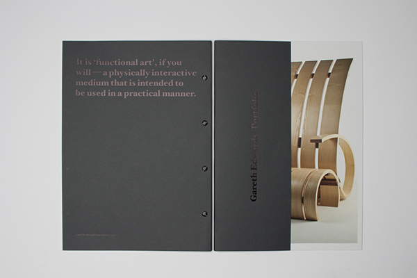
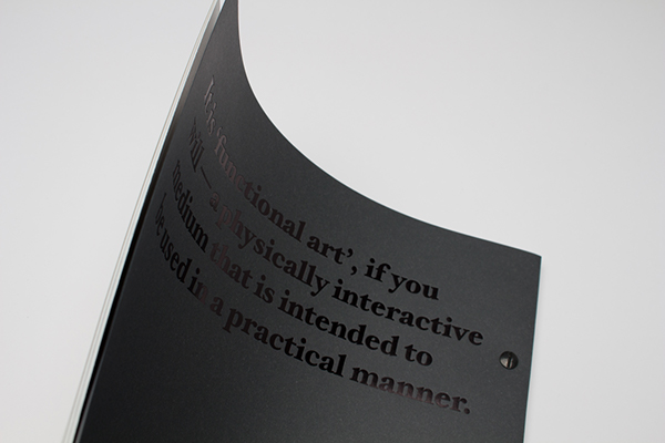
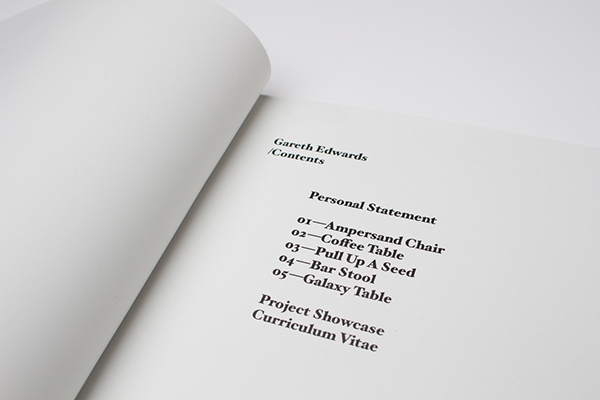
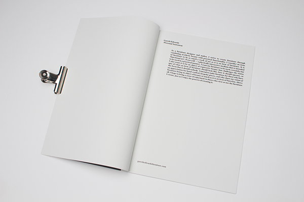
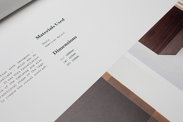
- Portfolio booklet introduces viewers to the carpenter and also showcases some of his projects - something like this would hold relevance to my outcome as I need an outcome to introduce me to possible clients/employers that also simultaneously displays some examples of my strongest projects.
- Monospaced typeface used for the body copy in the book has a simple form, is legible and helps to form a professional aesthetic.
Marco Oggian - NowPix Branding.

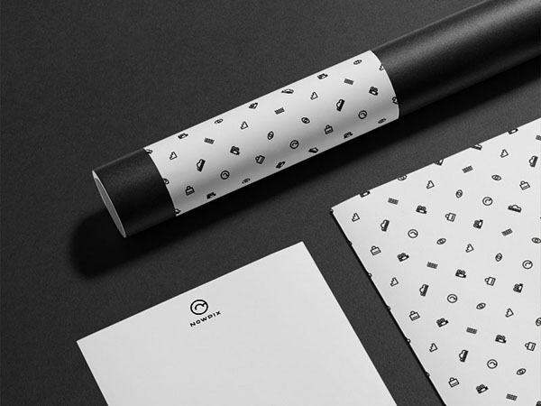

- A pattern relevant to the rest of the branding aesthetics has been created and applied to various aspects of the outcomes. The simple pattern helps to form an interesting visual aspect for an otherwise minimal project.
- Additionally, the letterhead has been printed on both sides, on its reverse the pattern is featured which I found to be a really interesting feature of the project - I will utilise a similar idea when creating my outcome.
Pavel Emelyanov - Sommelier Markov Anatoly.
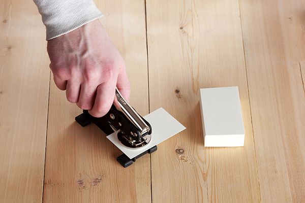
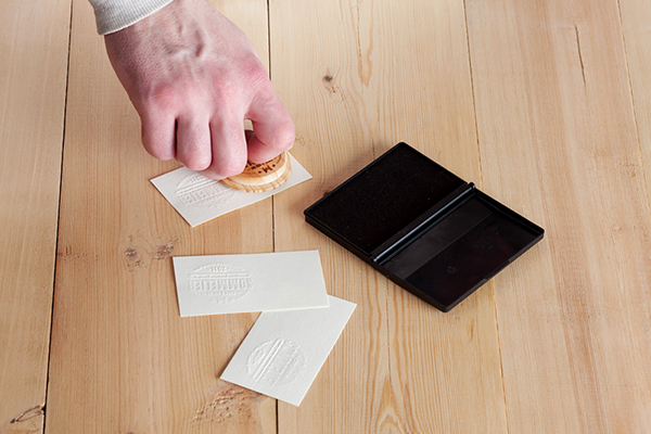
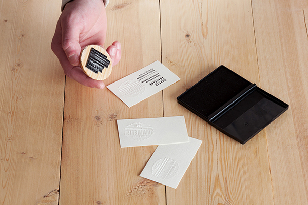
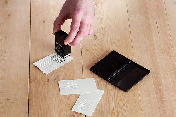
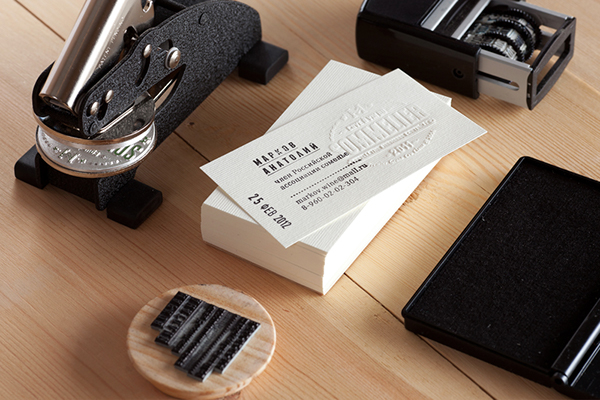
- The stamps and embossing plate remove the need for any printing - environmentally friendly business cards could easily be created using this method.
- I could use the same method displayed above combined with some naturally coloured recycled stock to create a set of sustainable, aesthetically engaging business cards relevant to my practice.
Foreign Policy - Wanderlust.
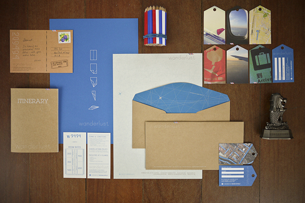
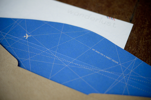
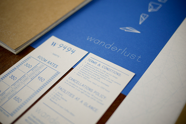
- Simple refined colour scheme helps to form a cohesive engaging outcome.
- Good range of relevant design outcomes - I will need to consider what outcomes are relevant to my personal branding. Ideally I would like to produce a wide range of outcomes similar to the project displayed above.
- Additionally, when presenting the project the designer has also chosen to feature additional aesthetic elements relevant to the projects context such as pencils a statue - When photographing my work I will also feature contextualising elements to give my project further relevance and to add an additional visual aspect.
Oddds - The Arcane
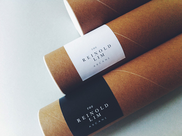
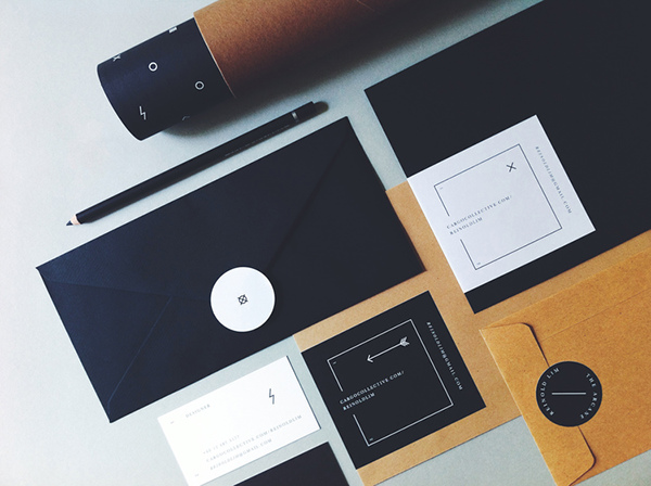
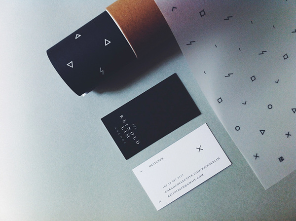
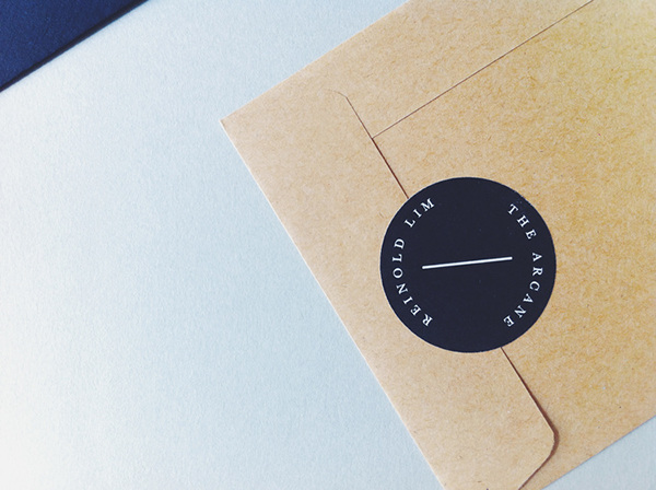
- The natural colour of the brown stock used is something I am aspiring to apply to my project.
- The postal tube also has the addition of a branded sticker, as I am planning to include a postal tube as part of my outcome I will consider producing a similar outcome featuring my branding and client address.
- Finally, the envelop is also sealed shut with a sticker, this holds the envelope closed and acts like a letter seal - I really like this concept as it adds an interesting aspect to the letter and shows the contents have not been tampered with.
Britton Britton - Massproductions - Graphic Identity.
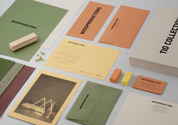
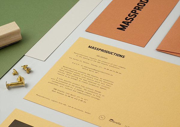
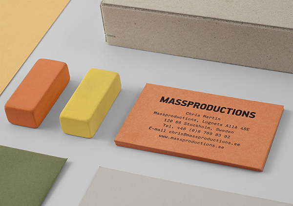
- Again, this project showcases a good, coherent stock selection, although the colours are far from what I want to utilise the project showcases the impact that I want to achieve.
- Additionally, the gridded presentation of the project elements is also something I want to replicate when photographing my outcome.
Alexandra Whitter - Recycled business cards.
- The recycled grey card stock the business cards are printed onto is the exact type of stock I want to utilise when creating my personal business cards.
- The natural colour of the stock will form a nice cohesive aesthetic with the other naturally colours stocks with brown and light grey tones.
- Additionally, I could also edge paint the business cards using a DIY technique similar to the one that has been ustilised to produce the business cards displayed above.
Socio Design - Self Branding.
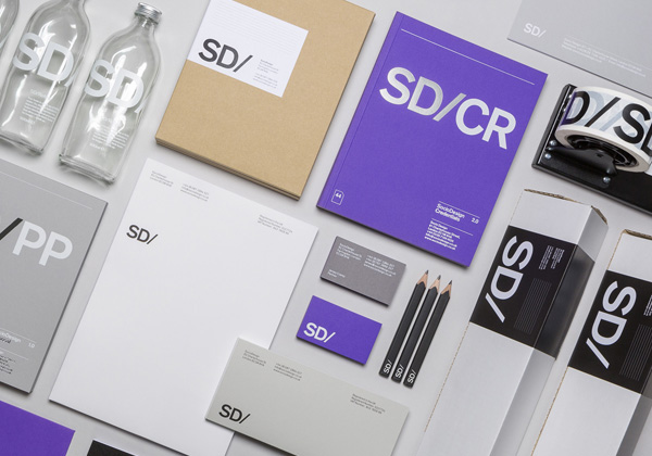
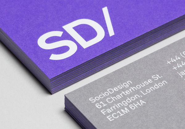
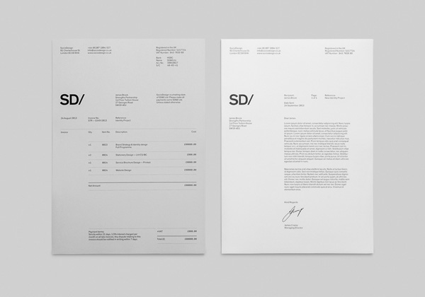
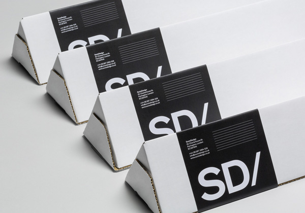
- The consistency of visual elements in this project help to form an engaging, recogniseable company identity for Socio Design - when creating my outcome I will apply visual elements consistently across all design elements to help form a strong aesthetic.
- Additionally, the postal tubes utilised by the company are triangular shaped, this is interesting as I have not seen this style of postal tube before.
Jonathan Shackleton - Personal Identity.


- Consistent visuals such as the logo and refined stock choices help to create a strong, visually engaging branding project that screams professionalism.
- Contrasting colours of the stocks help to form an interesting visual aspect for the project - I could recreate a similar contrast between the naturally colours stocks I want to utilsie.

No comments:
Post a Comment