Saturday, 17 November 2012

CONTEXT OF PRACTICE - AESTHETICS


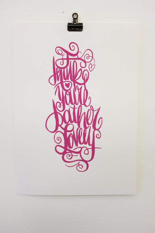
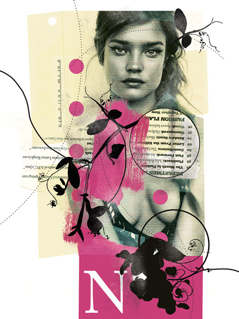
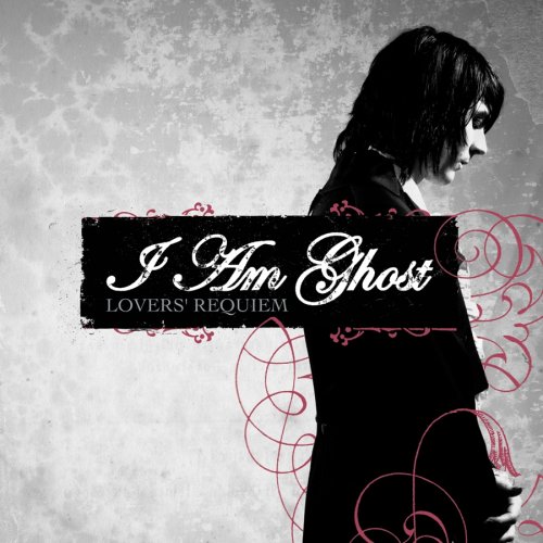
For our second context of practice session we had to bring examples of work we either loved or hated. We had to bring a total of six images, two displaying just type, two displaying only image and two displaying both type and image.

Here are the examples of work that I like.


Liz Clements Illustration.


Here are the examples of work I dislike.


Next, we the produced a list of aesthetic reason as to why we either likes or disliked the designs. Using this list as a reference, we then used sticky notes to document the specific aesthetic reasons as to why we liked or disliked our designs.


The next exercise requested us to swap our three images with another person. We were given a short amount of time to look at the work, then we had to write our personal opinion of the aesthetic quality. This exercise showed us how good design should instantly communicate the message in a clear yet visually appropriate way. Moreover, I also learned that initial response is subjective, and is based on personal influences and taste.


After completing the task we had to think of three rules regarding design


Then as a class we created a refined list of aesthetic rules, it was hard to create rules that didn’t include anything about style or skill.


Aesthetic Rules

  • All design must use no more than three typefaces.
  • All design should be structured.
  • Designs should use limited colours.
  • The message must be clearly communicated.
  • The composition of the design must be balanced.
  • Type used on the design should be legible.
  • Aesthetic should help contextualise image.
  • The aesthetic must not overpower the function.
  • The aesthetic should be refined.
  • Simplicity is key. 


Tuesday, 13 November 2012

STUDIO TASK 1 - CRITICAL ANALYSIS

Identify and explain 5 reasons why critical analysis is an important part of education, learning and devloping your understanding.


Identify and explain why the crit (group critique) is useful in the development of your work, skills and opinions.
Choose 5 criteria from the list that were generated during the studio session. For each criteria brefly summarise what will generally affect how you judge what you like and dislike when analysing examples of work. (you should aim to use the images that you brought to the session as examples).


5 REASONS WHY CRITICAL ANALYSIS IS AN IMPORTANT PART OF EDUCATION.

  • Helps us develop skills which help us assess what makes a design successful or unsuccessful, this knowledge can then be used to influence our own designs.
  • Critical analysis helps to develop analytical skills which can be used in critiques, both in university and in the professional environment.
  • Helps us to view work from a perspective (not biased).
  • Helps us to explain the decisions we have made.
  • Helps improve design skills.


THE GROUP CRITIQUE 

The group critique is useful in the development of our work as  they enable us to receive somebody else's opinion on what we are designing, if they struggle to understand the concept or struggle to read a specific typeface then certain design decisions would need to be changed. Sometimes, when you spend too long working on one project you can miss mistakes that you have made, the group crit enables us to receive constructive criticism formed by the opinion of designers working away from the project, they are the ones who are likely to spot any mistakes or see room for improvement. Furthermore, not only does the group crit allow us to receive feedback on our work, but also enables us to assess other peoples work which helps develop our analytical skills as designers. Finally, the group critique often enables us to present our work and explain the concept, this helps develop key skills which are essential to have in the professional industry, as designers we will need to be confident when presenting concepts or work to clients. 


List of criteria generated in class; 
  • Frame
  • Format
  • Figure/Form
  • Ground
  • Composition
  • Communication
  • Visual dynamics
  • Type
  • Image
  • Colour
  • Layout
  • Legibility
  • Readability


LEGIBILITY 

I think that legibility is essential to a functional design, if the audience cant define individual letters it will affect the overall readability of the piece. For a design to be functional and communicate its message the audience must be able to read the text, unless a specific design decision has been made to affect the legibility. I think that the three bottles shows a good legible typeface.

COMPOSITION

I also think that composition holds great importance to the success of a piece of design, if the graphics or type are not composed in a suitable way the whole design can be affected. Again I want to refer to the three bottles, I think that they show a good use of composition as the text has been rotated so it is vertical. This improves the simple design as it makes the bottle more interesting and leaves room for the text size to be increased. 


TYPE

A good choice of typography can really help make a design more interesting and engaging for an audience. However, the choice of typography must reflect the target audience or the message could be miscommunicated. The example above shows a typographic piece created for converse a shoe company, the piece cleverly refers to the companies products by adding lace ends to the ends of certain letters. The typography is interesting, clever and appealing to the companies target audience, therefore the design is successful.


COMMUNICATION

I personally believe one of the most important factors of design is communication, if a piece of design is not communicating its message then it is useless and there is no point for that piece of design to exist. Therefore, it is important that a piece of design communicates its message well, this can be achieved by defining a target audience, collecting an informed body of research and producing a well designed piece. The above example shows how this can go wrong, the sign was produced to inform people that the activities shown are prohibited. However, the sign shows an almost fun looking illustration of each sport in a circle, it almost looks like the sign is encouraging the sports to take place. 


COLOUR

Finally, colour is also a definitive factor which defines the success or failure of a piece of design. The colours chosen for a piece of work must work together, contrasting colours create horrible looking design similar to the example shown above.

CRITICISM


Today, I had a critique with Richard, in this we looked at the work that I have completed over the past few weeks for OUGD401. 


Summarising the feedback I need to;  Avoid first person analysis.
                                                                 Include dates for all posters.
                                                                 Include quotes to back up analysis.
                                                                 Include classic ‘Modernist’ designs in my
                                                                 examples of modernism/post modernism.


Thursday, 8 November 2012

CRITICAL ANALYSIS


Today, we had a lecture with Fred that introduced us to design principles. I found this lecture really interesting as I want learn more about the nitty gritty of graphic design.


We were given aims that we would be covering in the following sessions:

  • Introduce and explore fundamental principles of visual literacy, colour theory, typography, layout and format.
  • Explore principles of communication through type and/or image in relation to graphic design practices.
  • Encourage individual approaches to the exploration and application of fundamental design principles to specified problems.


After being introduced to the aims of OUGD401, we looked at the meaning of Visual Literacy otherwise known as the language of graphic design.

  • The Ability to construct meaning from visual image and type.
  • Interpreting images of the present, past and a range of cultures.
  • Producing images that effectively communicate a message to an audience.


Next we looked at the meaning of visual communication;

  • The process of sending and receiving messages using type and images.
  •  Visual communication is based on a shared level of understanding of different symbols, gestures and objects.
  • Visual communication is affected by audience, context, media and methods of distribution.


After learning about what defines visual communication I noted down a quote that appeared regarding language.

‘All that is necessary for any language to exist is an agreement amongst a group of people that one thing will stand for another.’

Following this Fred introduced us to a range of different symbols, we were asked to comment on what we thought these symbols meant. We soon discovered that some symbols can be misleading due to having multiple meanings. However, when displayed next to another symbol they gained relevance. An example can be seen below.


A cross on its own can have multiple meanings, but when showed next to a multiplication sign its gains context as a symbol used in mathematics.


Next we were shown a range of road signs, I found it interesting looking at the design decisions. Road signs use a mixture of simple shapes and graphics communicate complex road signs.

We also learned why warning signs such as the ‘STOP’ and ‘GIVE WAY’ are a different shape to all other road signs. The information that they display could be life saving, but if the design was obscured by snow or dirt the audience would not be able to see the vital information. Therefore, they made important signs a recognisable shape, so even if obscured the basic shape can still be perceived.


All of the theory about signs, symbols and signifiers comes under the topic of semiotics.

Key elements in visual language in graphic design.

  • Frame
  • Format
  • Figure/Form
  • Ground
  • Composition
  • Visual dynamics
  • Type
  • Image
  • Colour
  • Layout
  • Legibility
  • Readability


Before the session ended we were given two tasks to complete.

The first requested us to collect four A5 sized images, two of design we love and two of design we hate. This needed to be accompanied by a reason as to why they have been chosen.

LOVE

First, I found these bottle designs, created by Jamie Conkleton each bottle contains Sake a type of alcohol. I like the designs as they are part of a set, and I like the link the designer has made between how refined the sake is and the opacity of the bottle.  Moreover, there is limited information displayed giving the design a minimalist feel. Finally, I really like the innovative way that the type has been placed.


The second piece of design that I love is by Queen City Studios; it’s a simple logo variation done for Converse. I like the design because of how relevant to converse it is. The script styled typeface has cleverly been adapted to look like shoelaces. I believe this is a fitting representation for a shoe company.


HATE

The first example of design I hate are these three signs. The signs have been designed to warn people that said sports are prohibited, I believe they are massively misleading. A sign communicating something that is prohibited should have a diagonal line across the illustration. Instead, the signs show fun looking illustrations in a circle, leaving them open for misinterpretation. Due to this the signs are not functional, which is why they are badly designed. 


Secondly, I looked at a logo design done for ‘Cazz’s Sports Bar ‘n’ Grille’. The logo is awful. The typefaces chosen to display information such as the name do not mix well at all. Moreover, the text reading ‘Sports Bar ‘n’ Grille’ has been placed horribly, it looks like whoever designed the logo had no idea about layout. Furthermore, the illustrations that have been included in the design are weak and astatically upsetting. 


At the end of the session we were set a task to select five fonts from the macs with different characteristics.


Blackoak STD.


The first font I have chosen to look at is called ‘Blackoak STD’, it is a bold serif font that reminds me of retro letterpress type. I think that the font is legible due to the width of the letters, making the font a perfect display typeface.      


Birch std.


The next font is ‘Birch STD’ this typeface also reminds me of wooden type that would be used in a letterpress. The font is extremely legible even at a small size, making it perfect for magazine text. The font is recognisable due to its angled serifs. 


Calibri.


Next, I looked at Calibri, a sans serif font with slight roundings on the corners of the letters. The typeface is legible at a small size due to a standard letter proportions and recognisable letterform. I like the font due to its legibility, and believe it would work well as a screen and print font.


Edwardian Script.


After looking at some relatively simple fonts I chose to look at something different, ‘Edwardian Script’ is a script font that reminds me of old hand written calligraphy. I believe the font is legible, although when presented in bulk at a small size it can be overwhelming due to complexity of the letters. Furthermore, the letters join perfectly making the font a close replica of elegant handwriting. 


Hattenschweiler.


Finally, contrasting the elegance of ‘Edwardian script’ I chose to look at a font called 'Hattenschweiler', a bold sans-serif typeface that could be compared to ‘Impact’. The font loses legibility at a small size due to the spacing between letters, however, when used at a large size the font is clear and strong.