Research
In
class today, we were asked to write down a list of problems we have encountered
living in Leeds and attending Leeds College of Art. We discussed as a group
common problems that we had encountered, it was interesting to see how many
similar issues that we had. We formed a list and highlighted what we believed
to be the three main problems that we had encountered as a group. We eventually
were given the problem to resolve, ours was ‘How to conduct a presentation in
front of your new class’

Sarah and Danielle started collecting tips and tricks to help with public speech, this formed the basic information which would be presented in the flyer. Moreover, it would be easier to design the layout as we now know the amount of information that needed to be displayed. They collected information from the websites below.
http://www.speech-topics-help.com/fear-of-public-speaking-statistics.html
http://www.udel.edu/communication/ocf/tipsheets/public-speaking-stats.html
http://publicspeakingsuccess.net/archives/340
After careful thought about how to present our information, we decided upon producing a flyer and a poster. The flyer would display the bulk of the information and the poster would be used to capture the attention of the audience, advertise and hold the leaflets. We decided to keep what we produced relatively simple, as we had to consider what we could produce in time to meet the deadline.
(simple flyer designs)
We collected research, half the group collected research possible ways we could display information and the other half on different flyer layouts. The flyer needed to be a small size so it could be easily stored in someone’s pocket or wallet, so if needed, they could quickly revise the tips on the flyer. We initially decided upon creating a flyer that folded out to the size of an A4 piece of paper. However, after making a mock-up version of this we encountered problems with opening and closing it.
This flyer came in a small envelope
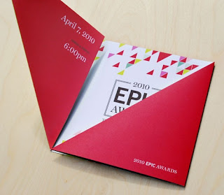
Below is a flyer that experiments with a
very unusual way of folding.
Some different folding techniques
Unusual folding technique
This flyer came in a small envelope
The two smaller flyers would fit perfectly in a
wallet
Below is a flyer that experiments with a
very unusual way of folding.
After revising the flyer proposal we decided a more suitable design would be a concertina (accordion) fold. This way we could easily achieve the small size needed, have enough room to display the information and avoid the folding issues we have with the previous design. Due to the shape of the flyer we decided to adapt our poster shape so it was also long and thin, much alike the flyer when unfolded. A point was made early on in the design process that there should be a consistent theme running throughout the project.
This piece is very similar to what we have in mind.
Our mock-up of the concertina fold.
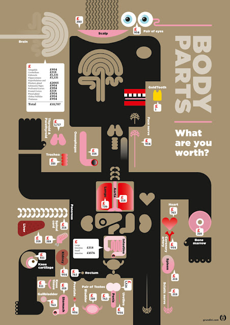
Research was then carried out on how to display information in an exciting way. One main factor that effected how we displayed this information was the shape of the flyer, as it is long and thin we decided that one collum for information was the best option. Our research then lead us to info-graphics, these displayed what would usually be boring information in an exciting, illustrative way. Moreover, the composition of info-graphics was usually long and thin much alike the shape of our flyer, it was decided that this the best way of displaying our information.
As
you can see in the research above info-graphics are designed to present
information in an interesting way, this is achieved through a mix of layout,
illustration and type. I believe that this is the best way to present our
information to our target audience, as it will keep them engaged.


No comments:
Post a Comment