In todays seminar with Richard we learnt about graphic design and
modernism and the relationship they share. I came to the understanding that
graphic design was born out of modernism, and its strict rules.
We first started by looking at work by Filippo Tommaso Marinetti
who founded the futurist movement; he experimented with type and layout to
convey onomatopoeias, an example of which can be seen in his work ‘Parole in
Liberta’. His piece not only applies a minimalist context, but also experiments
with type layout and placement.
 |
| http://www.creativepro.com/files/story_images/070802_fg1.jpg |
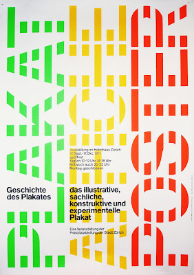
Moreover, we also looked at work from Swiss designer Joseph
Muller-Brockmann, a designer whose work revolves round grid layouts and
typography. The work he creates is timeless as he utilizes clean, simplistic
fonts combined with a neat layout.
 |
| http://wordsandeggs.files.wordpress.com/2010/02/josef_muller_brockmann_2846.jpg |
Finally, we ended the session with an interview with designer
Massimo Vignelli, were he talked in detail about his designs for a map of the
New York Subway. The map is simple, making it clear and easy to follow. Its
obvious that Massimo is a modernist designer as his map combines functionality
with simple graphics and type, creating the epitome of modernistic design.
 |
| http://www.newyorkboundbooks.com/wp-content/uploads/2012/02/vignelli-map-1972.jpg |


No comments:
Post a Comment