
ALPHABET SOUP
On
Monday we received a new studio brief called ‘Alphabet soup: Visual thinking’,
the brief requires us to produce a series of ten letterforms that explore and
communicate our interpretation of a word that we would randomly select during
lesson. Out of the randomiser I got the word ‘Boom’, a word I initially though
would be easy to work with. However, I wanted to try something different as the
brief stated that we should avoid the ‘obvious responses’.

Over summer as part of our summer brief we had collected a body of
research showing letterform variations, we discussed ways that you can sort type
and organised them into categories.

organised letterforms
Our
categories were:
- Serif
- Sans-serif
- Objects in the form of letters
- Uppercase
- Lowercase
- Hand rendered
- Digital
- Italic
- Bold
- Calligraphy
Below are images documenting some of the sorted groups of letters.

'Objects in the form of letters'

'Hand rendered'

'Upper case'

'Sans serif'

'Calligraphy'

'Bold'
The letter groups formed the base of our initial
research for the brief.

I
started my further research by finding out the definition of the word boom.
boom 1
v. boomed, boom·ing, booms
v.intr.
1.
To make a deep,
resonant sound.
2.
To grow, develop, or
progress rapidly; flourish: Business is booming.
v.tr.
1.
To utter or give
forth with a deep, resonant sound: a field commander booming out orders.
2.
To cause to grow or
flourish; boost.
n.
1.
A deep resonant
sound, as of an explosion.
2.
A time of economic
prosperity.
3.
A sudden increase, as
in popularity.
The highlighted definitions are the
ones that I believe I could work with to create my letterforms; with a better
understanding of the word boom I started generating ideas for possible
outcomes.

After generating ideas I highlighted
the concepts that I believed to be strongest in yellow, which in this case it
was the sound wave idea. Additionally, the ideas which I think are less
relevant are highlighted in red, I believe these ideas are slightly less important as they are linked from the word explosion, which is a phrase that is associated with the word boom but not a definition. I will research both ideas thoroughly until I have a strong base of research to work from.
-->

http://provide.smashingmagazine.com/related-posts/related-posts-legitima-typeface.jpg
This
image is directly relevant to the repeated outline idea, and uses technique I could
adapt to produce my letters.

The
alphabetical echo by Eduard Haiman uses a similar concept to my sound wave
idea. Using animation Haiman has created letters made up from tiny dots, the
dots move to form the next letter to the sound of an alphabetical echo.
Although Haiman’s idea is presented in a different media I believe I can
achieve a similar effect using static sound waves.
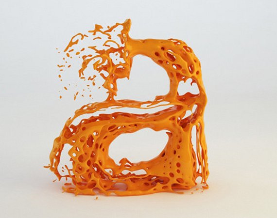
I chose to look at the above type because of its likeness to an explosion. It was designed by skyrill.com a web design company run by two brothers. They used a ‘Fluids simulation tool’ to fill in letter shapes until they exploded. Although I believe an explosion is too obvious of an outcome I really like the outcome that has been achieved. Finally, I have been inspired to experiment with generating some letterforms that have a similarity to an explosion.

I
chose to feature the above typography as it is relevant to my idea of an explosion
or expansion. The piece the application of some water droplets to an inked type
piece, because of the water parts of the piece are expanding and others are
becoming faint and decaying.

The above typographic piece was created by Elise Gettliffe. I have included the piece in my research because
of the introduction of particles moving away form the piece like shrapnel from
an explosion. I could experiment with creating something similar to portray the
word ‘BOOM’.

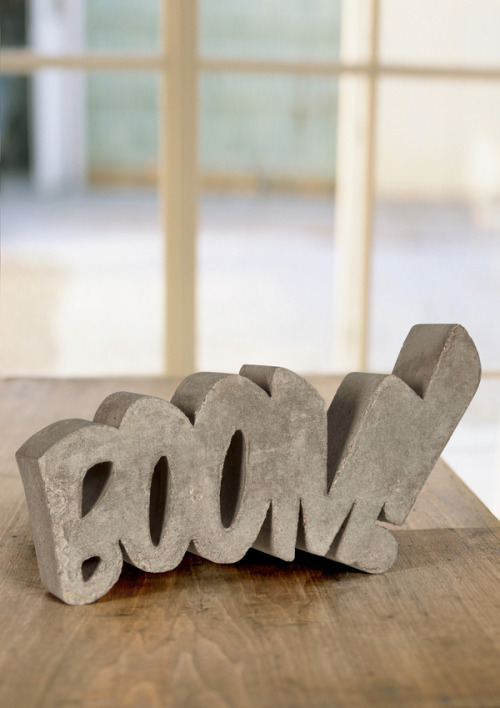
I
have chosen to feature this image portraying a typographic sculpture of the
word ‘BOOM’. Instead of relying on effects to portray the meaning the
typography focuses on scale and kerning, this is also something I could
consider when designing my letterforms.

Additionally, the above type is also immediately relevant to my idea of an explosion, however this time the type looks like it has actually exploded. Some of the letters look disjointed like separated from an explosion. Additionally, I like the effect that has been added to make the type look like its really exploding, something I could experiment with when producing my letters.

I started researching into the science of sound waves, as I believed it was important to know how a ‘deep, resonant sound’ would look. I had a basic knowledge of sound frequencies but wanted to reiterate this information. As shown above a sound wave with a low frequency has a longer period between each wave.

I next started exploring
as to how I could adapt sound waves to portray a letter form. I chose to look
at Joy Divisions iconic design by Peter Saville as it reminded me of the peaks
associated with sound waves. There are certain aspects of this design that I
will experiment with when producing my letters.


Finally, I found this poster that is part of a set done for the ministry of sound. Designer Andrew Bradford created the pieces out of coloured card, sticking layers down to create the sound wave effect. Bradford has used a similar concept to Saville however adapted his technique of creating it. I will need to consider how I will create my letter forms and make them different to similar designs that already exist.
As I had now an idea of how to produce my letter forms I had to decide on a base font. I need a base font to form the base shape for my letters, due to the nature of production I believe that I need to use a big bold font so that the letters are still legible. Therefore, I started researching into possible fonts that could be used.
The first font I considered usable was 'Code' which is a free font that I found on Behance network. It reminds me of a mix between 'Helvetica' and 'Avant Garde', the font is clean, modern and has a bold variation which I could use.

I also considered using 'Impact' a font well known for being bold and strong. This was the main reason I considered it as an option, as I need a bold font to make my concept work. Impact is incredibly bold but still has enough room for a decent sized counter. When creating my type I will also experiment with using this font.

Additionally, I have also considered using font called 'Mission Script' the typeface comes in different weights so achieving the bold look needed wont be a problem. The type is unlike others previously looked as it is a script font, I believe this will make producing my letters more interesting.

Finally, the last font that I am considering using is called 'Gabo Drive'. Its a very bold font much alike the impact typeface however, it has subtle variations to the descenders as seen with the 'J'. I like this font and believe it would work when producing letters using my proposed method of production.

No comments:
Post a Comment