
After defining a final idea for the physical outcome I progressed towards the initial design decision stages of the project by collecting a body of visual research reviewing similar newspaper style publications.
The reasons for collecting a body of visual research are listed below.
RESEARCH RELEVANCE -
The reasons for collecting a body of visual research are listed below.
RESEARCH RELEVANCE -
- Inspiration.
- Review current newspaper design.
- Assess the varying forms of publications.
- Review stock choices.
- Review colour usage.
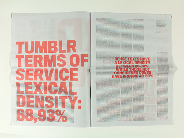
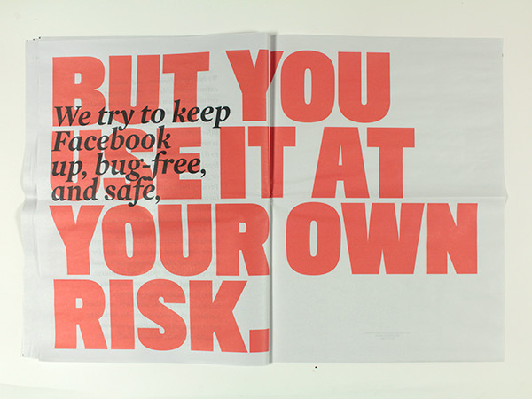
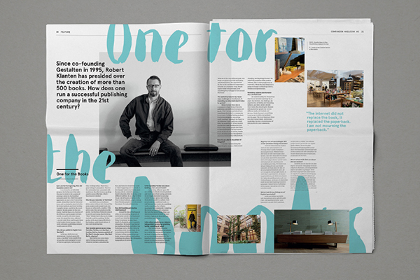
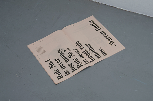
I have NOT read and agree to the terms of use - Cleber Rafael de Campos
Project Description - A typographical critique of things the author agrees to without reading.
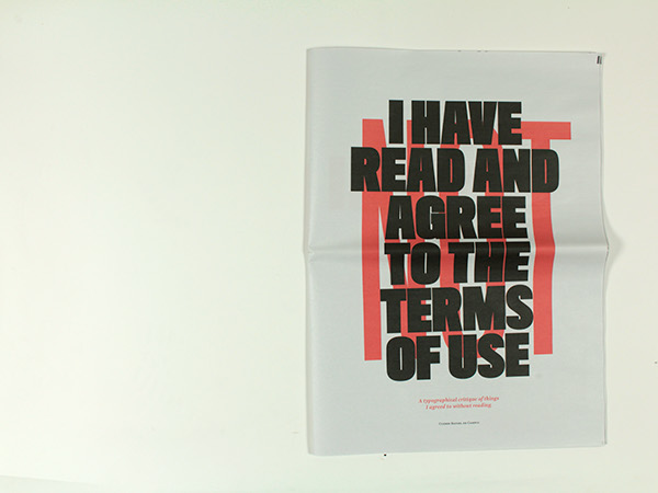
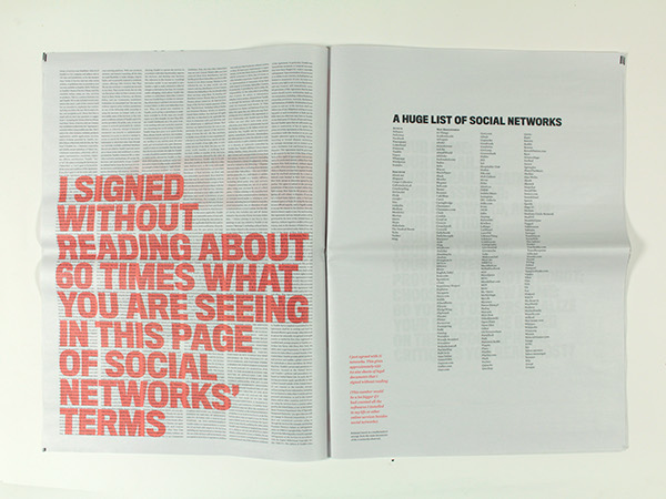
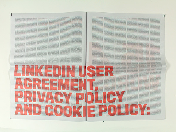
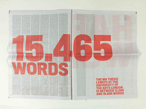
Project Link - Link
ANALYSIS -
- Two colours used - Simple and effective use of colour.
- Large text - Application of large coloured text grabs attention and immediately communicates information.
- Aspects of paper not always legible due to overlaying aspects of typography.
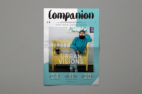
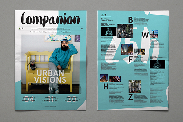
Companion No.2 - Chloe Galea
Project Description - Companion Magazine is a publication by Freunde von Freunden for 25Hours Hotels offering insight into the life and work of creatives living in the cities of Berlin, Hamburg, Frankfurt, Vienna and Zurich.
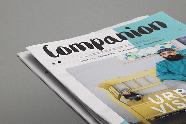
Project Link - Link
ANALYSIS -
- Images printed full colour.
- Two main colours used for rest of publications design.
- Vibrant use of colour engages reader and keeps them interested in the publications content.
- The effective use of typography and visual elements create an aesthetically engaging outcome.
- Layouts guide readers eyes across the pages composition effectively.
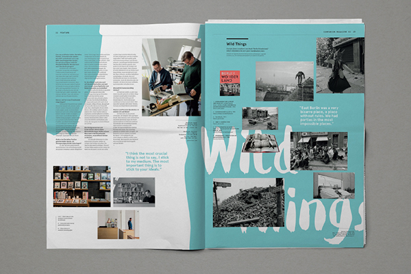
Paper Magazine No. 40 - Manos Daskalakis
Project Description - Paper magazine No.40, created as a supplement to Imerisia, the Athens based Financial Newspaper.
Project Description - Paper magazine No.40, created as a supplement to Imerisia, the Athens based Financial Newspaper.


Project Link - Link
ANALYSIS -
- Magazine size - Useful choice of form for the outcome that helps to make it portable.
- Effective balance of images and content - visuals help keep reader engaged.
- The limited use of colour helps outcome be more sustainable although this is not a decision purposely made by producers of the magazine.
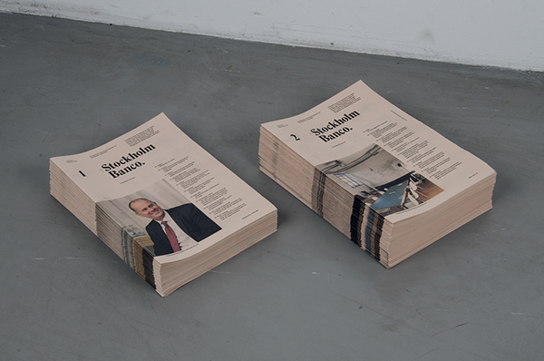
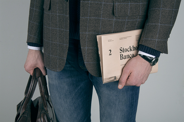
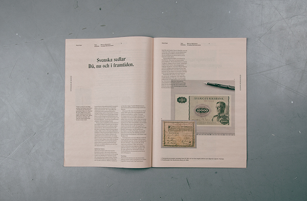
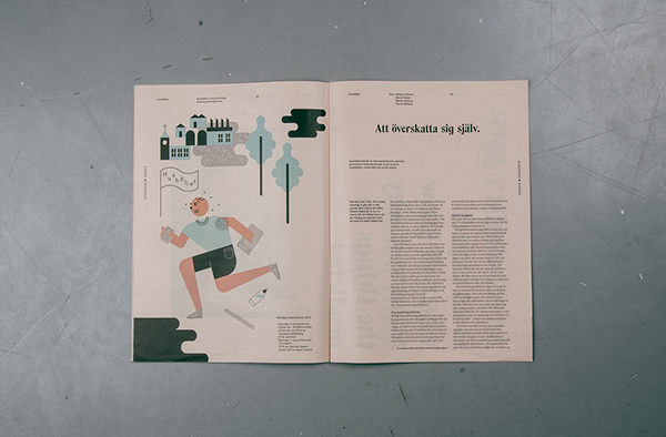
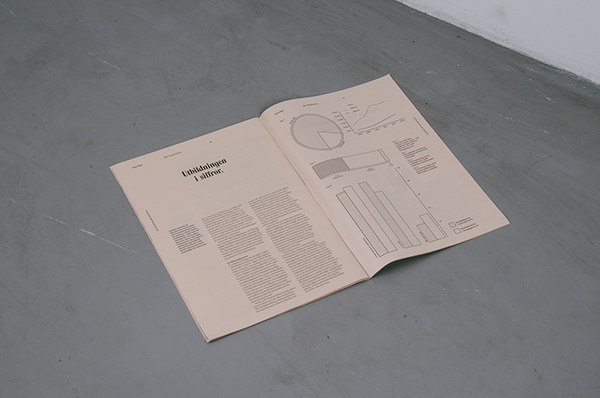
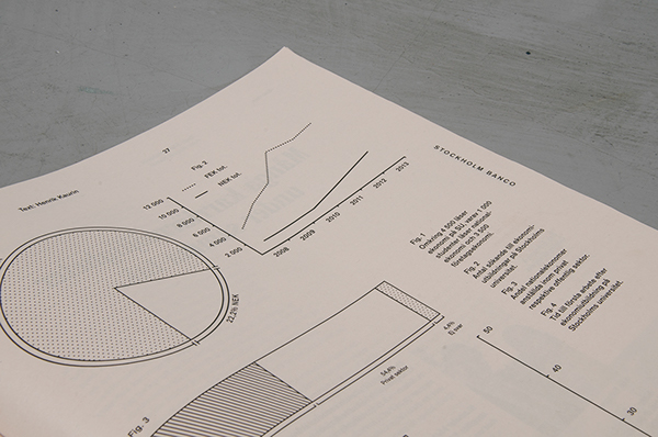
Stockholm Banco - Simon Jung Krestesen & Oskar Pernefeldt
Project Description - Stockholm University did not have a school magazine for their economy students which lead to students taking the problem into their own hands. The result of their endeavors is Stockholm Banco, an economics newspaper created by students for students.
Project Description - Stockholm University did not have a school magazine for their economy students which lead to students taking the problem into their own hands. The result of their endeavors is Stockholm Banco, an economics newspaper created by students for students.

Project Link - Link
ANALYSIS -
- Use of colour is limited to the illustrations and images - reduced environmental impact of production and printing costs.
- Publication size - Useful choice of form allows the outcome to be portable and eases reading while on the move.
- Strong use of grid based layouts applied throughout outcome to form a range of engaging page compositions.
- The off white paper stock used as part of the outcome stands out from the stocks used by publications previously looked at.
- Strong use of infographics to communicate statistical data - engages viewer with content heavy information.
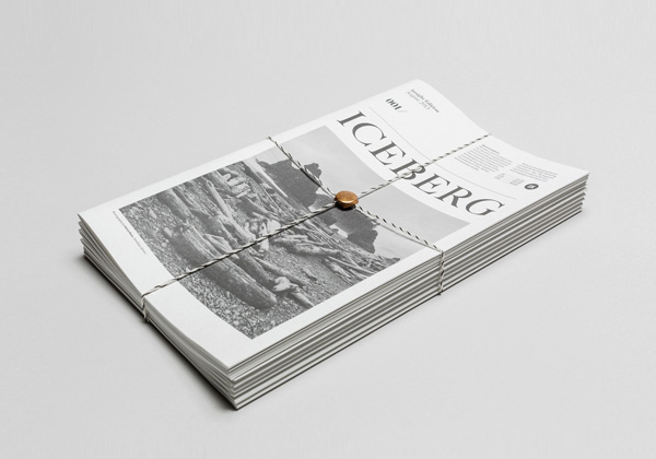
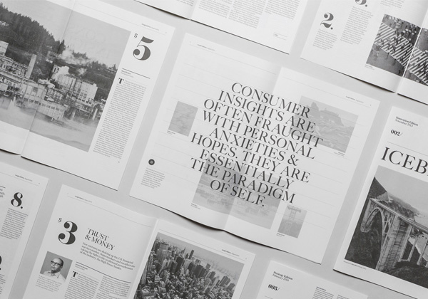
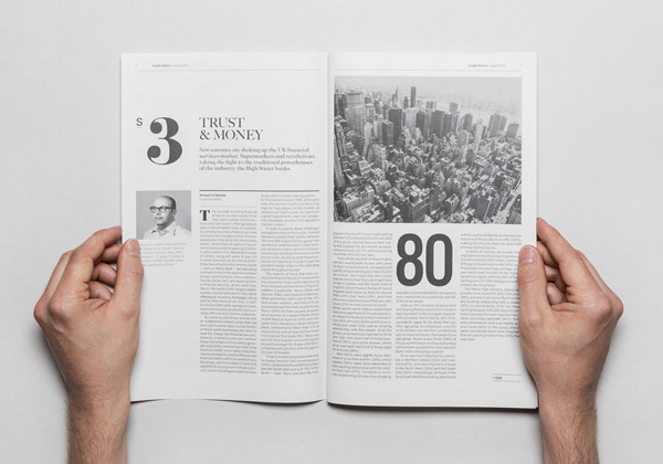
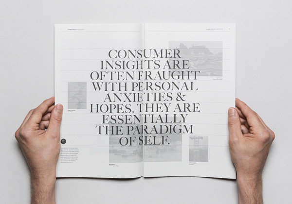
Iceberg - Socio Design
Project Description - Iceberg is a quarterly publication produced for KAE, which was named, designed and produced by Socio Design in London.
Project Description - Iceberg is a quarterly publication produced for KAE, which was named, designed and produced by Socio Design in London.
Project Link - Link
ANALYSIS -
- Page compositions - Layouts create a harmonious balance between written content and imagery.
- Limited use of colour - The publication is printed in black and white, reducing its environmental impact and its cost of production.
- Publication size - Useful choice of form allows the outcome to be portable and eases reading while on the move.
Nya Upplagan
Project Description - Music based newspaper produced and distributed in Sweden.
Project Description - Music based newspaper produced and distributed in Sweden.


Project Link - Link
ANALYSIS -
- Vibrant use of colour on the cover of the newspaper is engaging and invites readers to pick the publication up.
- The print technique used to produce the publication allows for the overprinting of images and illustrations which creates some really engaging visual effects.
- The use of negative space helps to balance the pages and ensures they don't appear too busy.
APPLICABLE ASPECTS -
After reviewing and analysing the design from a range of similar newspaper based publications I progressed with the project by reviewing my analysis of each one and selecting aspects that have a relevance and a possible application to my outcome.
APPLICABLE ELEMENTS -
- Large text - Application of large coloured text grabs attention and immediately communicates information.
- Vibrancy - Vibrant use of colour engages reader and keeps them interested in the publications content.
- Layouts guide readers eyes across the pages composition effectively.
- Limit use of colour - Use of colour is limited to the illustrations and images - reduced environmental impact of production and printing costs.
- Publication size - Useful choice of form allows the outcome to be portable and eases reading while on the move.
- Infographics - use of infographics to communicate statistical data - engages viewer with content heavy information.
- Print technique - The print technique used to produce the publication allows for the overprinting of images and illustrations which creates some really engaging visual effects.
No comments:
Post a Comment