
As outlined at the start of study task one I will be creating a publication that focuses on acting as an introduction to the mysterious substance ORMUS.

Ripley Scroll - George Ripley (1415 -1490) did not let his Augustinian monk role in Yorkshire prevent him from furthering his education in alchemy by travelling in Europe. After spending time in France and Germany, Ripley settled in Rome for about twenty years with Papal support. At the time of his return to England in 1477, it is alleged that Ripley was already in possession of the secret of transmutation from metal into gold.
- The selected scroll form of the outcome enables the designer to work on a continuous page, allowing illustrations and text to flow freely along the composition.
- The form of my outcome could take a similar form (scroll) to create a likeness to age old texts like the one above, this would also provide me with a large free space to work with in regards to composition and layout.
- I want aspects of my outcome to be very illustrative, similar to the work above. However I want the illustrations to monochrome, similar to the woodcuts reviewed in my secondary research.

Minature book of Alchemy.
- The size and scale of this outcome make it lack functionality as it is so small readers will struggle to read the contents and navigate the pages. The form does have one advantage in that it keeps alchemy related information secret as it is unreadable, linking to the alchemical ethos that information should be kept from those deemed unworthy.
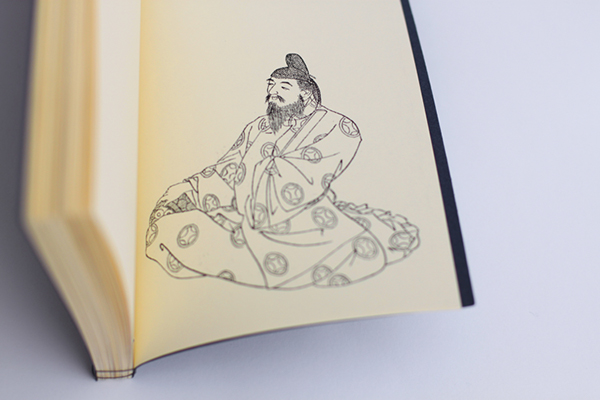
- The booklet includes illustrations similar as to what I want to utilise in my final outcome.
- Due to the tight timescale I am working to with the project I will unfortunately not have time to produce my own illustrations and will therefore have to use ones already in existence.

- The old tattered spines on these two books are very inspirational due to the decorative fleurons and typography that has been applied to them. When creating concepts for the form and function of my outcome I want to consider creating something with similar aesthetic qualities.

Link
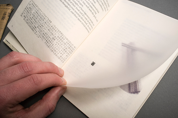
- The layout displayed on the right hand side of the book featured in the image above is another thing that has inspired me.
- The page successfully balances both bodies of text and alchemical illustrations to form a busy, yet aesthetically appealing page composition. When designing the layouts for my booklet I will ensure that I experiment with similar, engaging compositions.
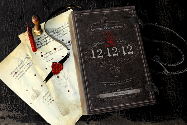
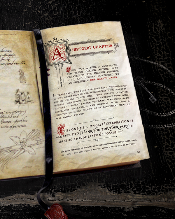
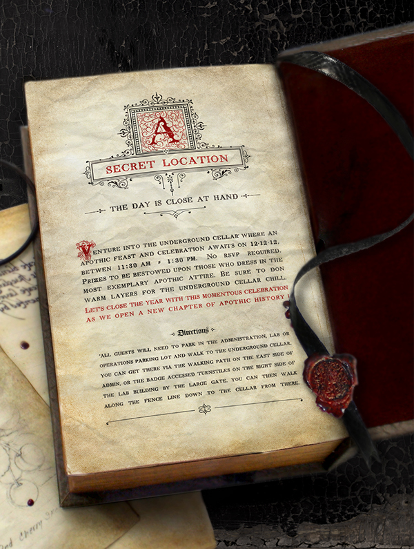
APOTHIC INVITATION
By Anh Vu
A series of invites to a mysterious event.
HAND MADE ALCHEMY CUP
By Darya Kunznetzova
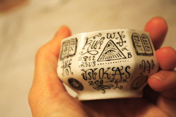
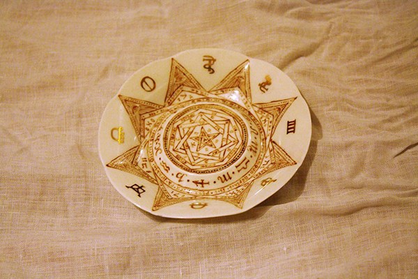
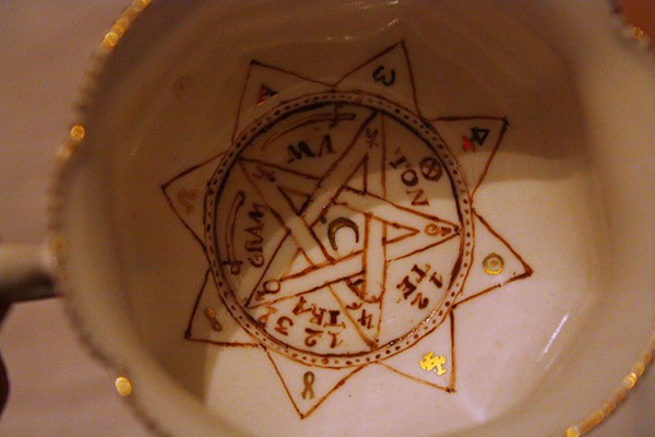
- Illustrative symbols applied to outcome are derived from Alchemy.
- My outcome will utilise similar visuals to form an aesthetic relevance to the research topic.
ALCHEMY BOOKS
By Tatiana Mirson
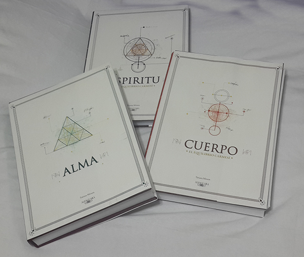


- The above book was featured due to the alchemy relevant visuals balanced with modern visual props. As my outcome is being designer for a modern audience I want to achieve a similar balance between age old alchemy illustrations with a modern aesthetic.
CLASSIC BOOK SERIES
By Jesper Olsson
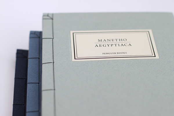
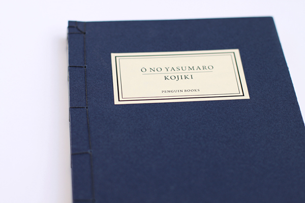
- The Japanese binding method featured on this booklet is visually striking due to the intricacy of the pattern featured at the opposing corners of the booklet.
- I hope to apply a similar binding method to my booklet to serve two main functions. Firstly, the stitch will act as a representation of the various stages of the alchemical process. Moreover, the binding method also, as mentioned above, also creates an engaging aesthetic feature which makes you want to investigate the booklet further.
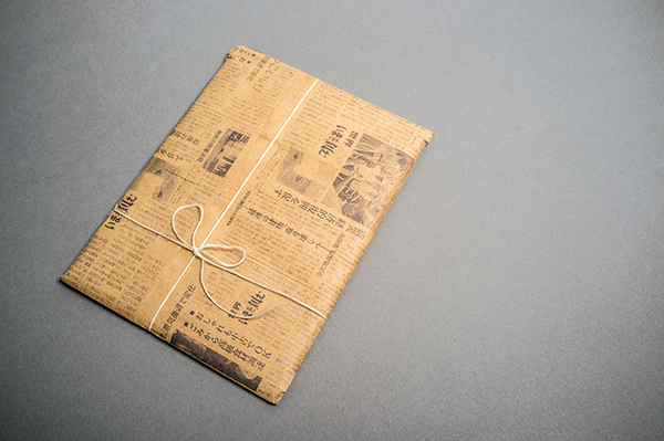
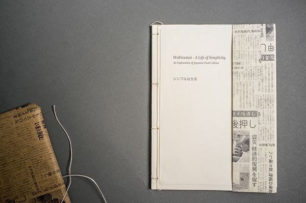
WABIZUMAI
By Padraig Croke
Link
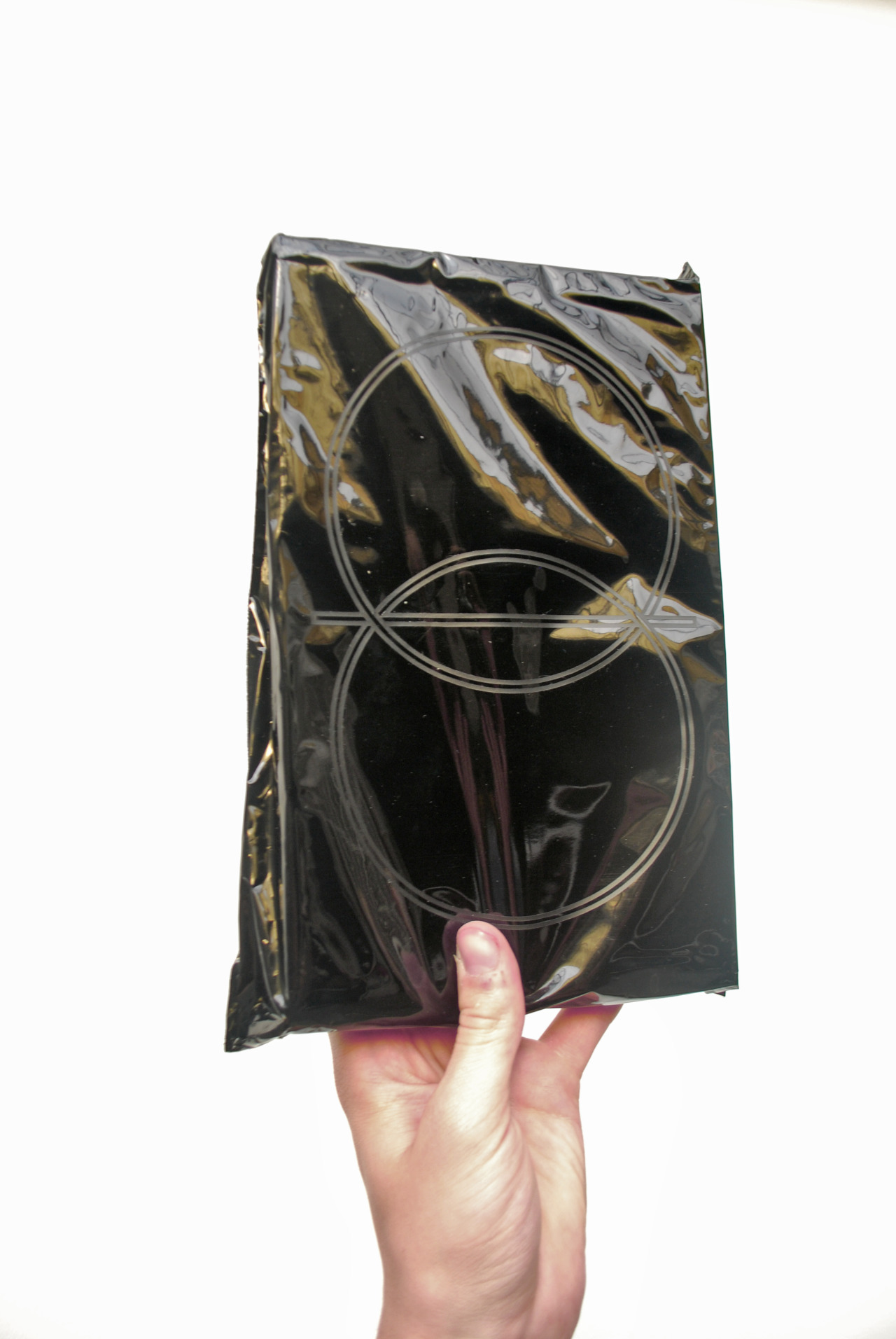
- The above booklet was featured because of the wrap that encloses it and because of the binding method applied to hold it together.
- The books wrap has relevance to its contents and also forms an aesthetic element users want to engage with further. When creating the wrap for my booklet I will also aim to create something similar.
- Additionally, the binding method, although less intricate than the one previously reviewed is also engaging and relevant due to the points mentioned above.
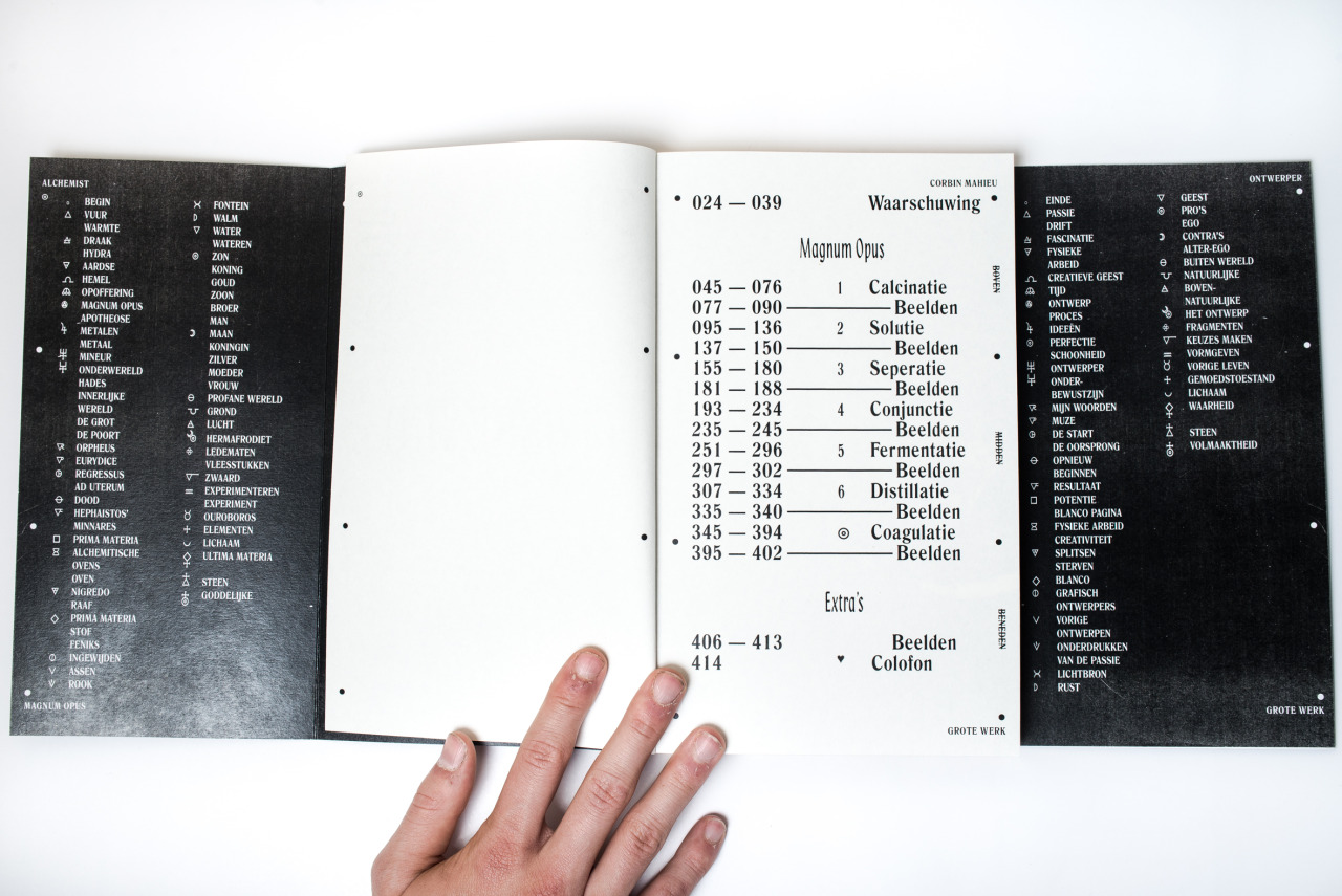
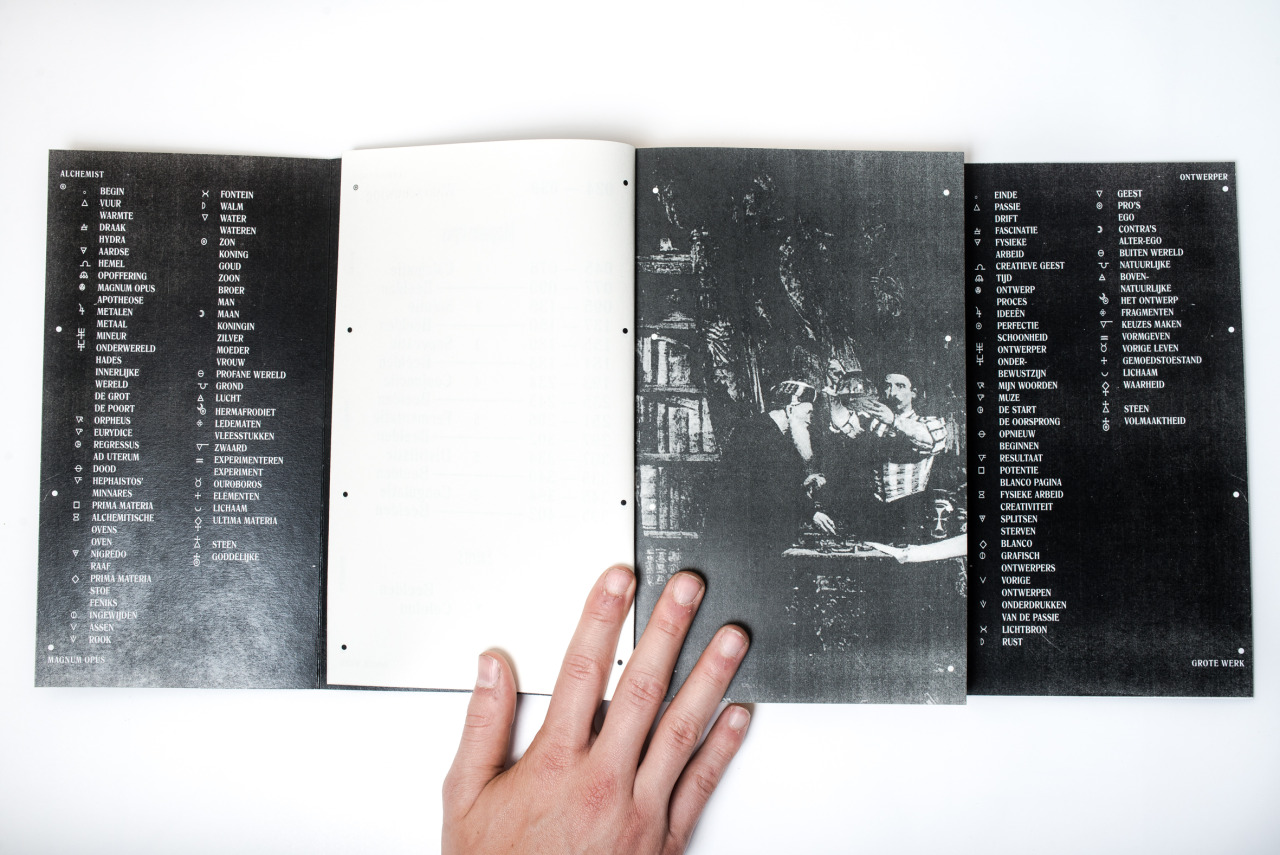
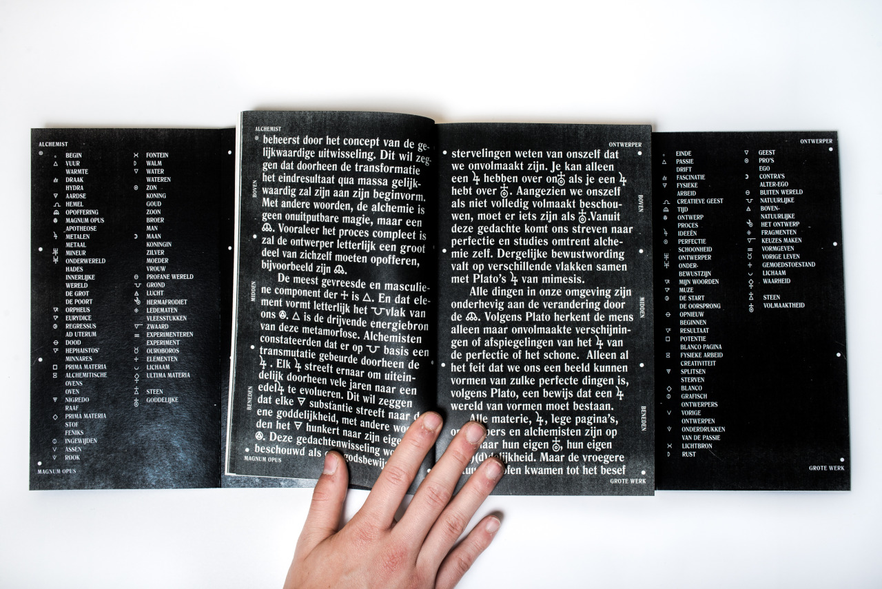
THE GRAPHIC ALCHEMIST
By Corbin Mahieu
Link
- The above project was featured as part of my secondary based aesthetic research because it is based around the subject of alchemy and so shares a lot of similarities with my project.
- The designer has chosen to create a very dark aesthetic which I believe represents the occult reference often associated with the practice.
- My book will also utilise a similar dark aesthetic. However, it will be much less over powering with an additional colour relevant to the subject.
No comments:
Post a Comment